The Aesthetic Dimensions in Art and Society

Chapter 6: Contrast

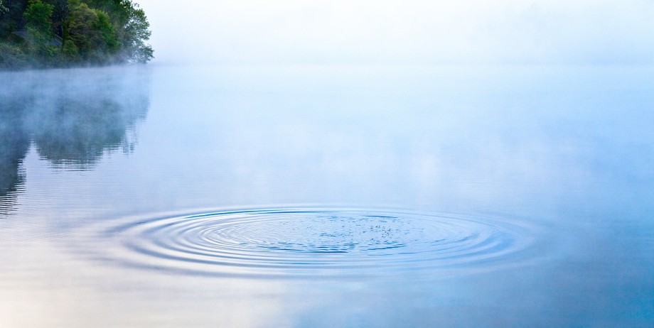
In photography, “contrast” is the ratio between the darkest dark and the lightest light within a frame. It’s said to be “soft” when there’s very little difference between the lights and darks,  “medium” in what we regard as normal, and “high” when an image has both maximum blacks and brightest whites.” Contrast is never one thing: it’s the difference between two things.


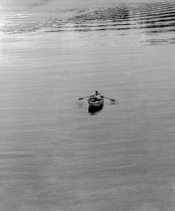
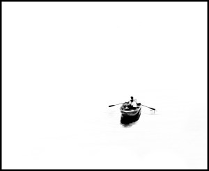
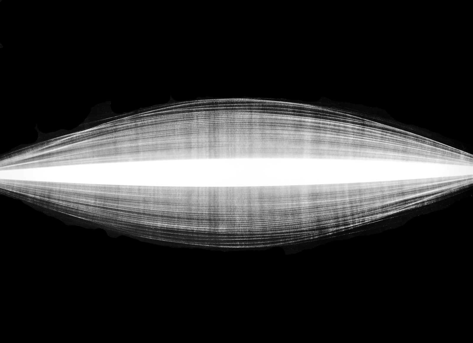
The low contrast image on the left  looks “muddy” because there is very little difference between the blacks and whites. A medium or “normal” contrast image has some deep blacks and bright whites, with a full range of grays in between. Generally, fine art photographers tend to print for the darkest blacks and the brightest whites which the substrate (usually photographic paper) can accommodate. This maintains some detail in the shadows and highlights. At the other end of the continuum, in this extreme high contrast image there are barely any grays. The whites are as bright as possible and the blacks are totally dark. While this effect can be accomplished in image editing software, I produced this effect in the darkroom. I began by making a duplicate of the negative on Kodalith film, an emulsion that only renders pure black and white.

In the digital world, cameras have a built-in histogram that displays brightness levels. These can be adjusted for each of the primary colors and the extremes of dark and light. Whatever the medium, Dmax (maximum density) and Dmin (minimum density) are devoid of detail. Being able to control contrast is both technically and aesthetically important because it determines the amount of detail that will be visible in the shadows and highlights. I highly recommend the “RAW” format for cameras because it  renders better quality by capturing a high level of image detail, which allows for greater flexibility and more options in editing software.

Creative Application

Aesthetically speaking, low contrast evokes a calm, flat or soft sensibility. There’s detail in the blacks and whites. These images are not seen very often because they’re not generally appealing. Extremely high contrast images are bold, evoking a sense of starkness and clarity. When I was apprenticing, I sometimes heard photographers use the word “snap” as an indication of the desirable contrast range. That’s where there are pure whites and pure blacks in the frame and a full range of gray tones in between—as illustrated in this grey scale.

This is a section of a “Kodak grey card.” Reflecting 18% of the light. Professionals used it with an exposure meter to determine the luminance under various conditions to get a reading of “middle grey,” camera settings that would yield the full scale of tones.

Ansel Adams equated the tonal scale of photographic prints with that of a piano octave. His ability to accomplish the full range of tones on photographic paper earned him a reputation as a master craftsman. For that reason alone, his original prints are far superior to the reproductions in books, posters and calendars. When he showed prints to our class at RIT in the early ‘60s, I was inspired to make black and white photography my principle creative medium.

Technique

Contrast is determined in the first place by lighting. Outdoors, cloudless sunlight creates high contrast—bright areas with dark shadows. Using editing software, photographers get better results by increasing the contrast of low contrast originals, rather than vice versa.

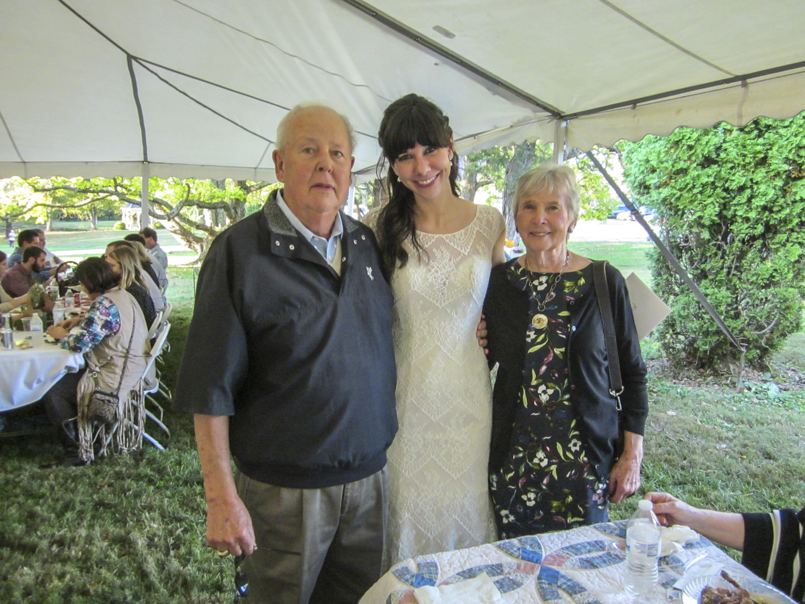
This is why wedding photographers prefer to shoot groups in the shade or under a diffuse cover on a bright sunny day—and use flash, not only to freeze the action, but also to establish highlights in the eyes. Working inside with lights, the standard practice or “starting point” for portraits is to use three lights—a “key” or main light that illuminates one side of the subject, a less intense or feathered “fill” light that provides some detail in the dark shadows created by the key light and a “backlight” positioned behind the subject to convey a sense of depth by creating a rim around the subject. To maximize contrast, eliminate the fill light altogether. To decrease contrast, bring the fill light closer to the subject. Having the key and fill at the same distance from the subject creates a very flat look.

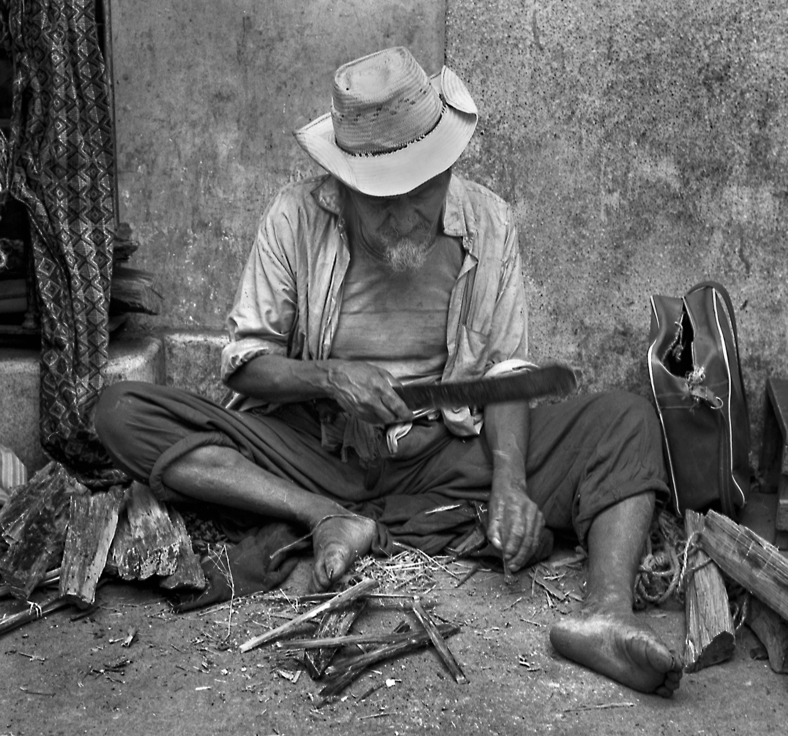
Being the brightest light relative to others being used, the key is usually positioned where the primary source would be— whether actual or imagined. This man was photographed at night for a book cover. I reasoned that, because the train was stationary, the light would be coming from the railroad station. So I placed a single 1000W quartz light to simulate a night light on a platform. The tiny bulb maximized its specularity, thereby enhancing the sharpness of his skin and the texture of his hat. It also put a highlight in his eye.  So the hat wouldn’t cover his eyes I had him look up rather than down, where passengers would normally be. The contrast was extremely high, so using editing software, a bit of detail was added to the shadows, mostly to give the image some depth. Relative to composition, the white shirtsleeve serves as a vector that directs the eye to the conductor’s face.

Reflections on Social Contrast

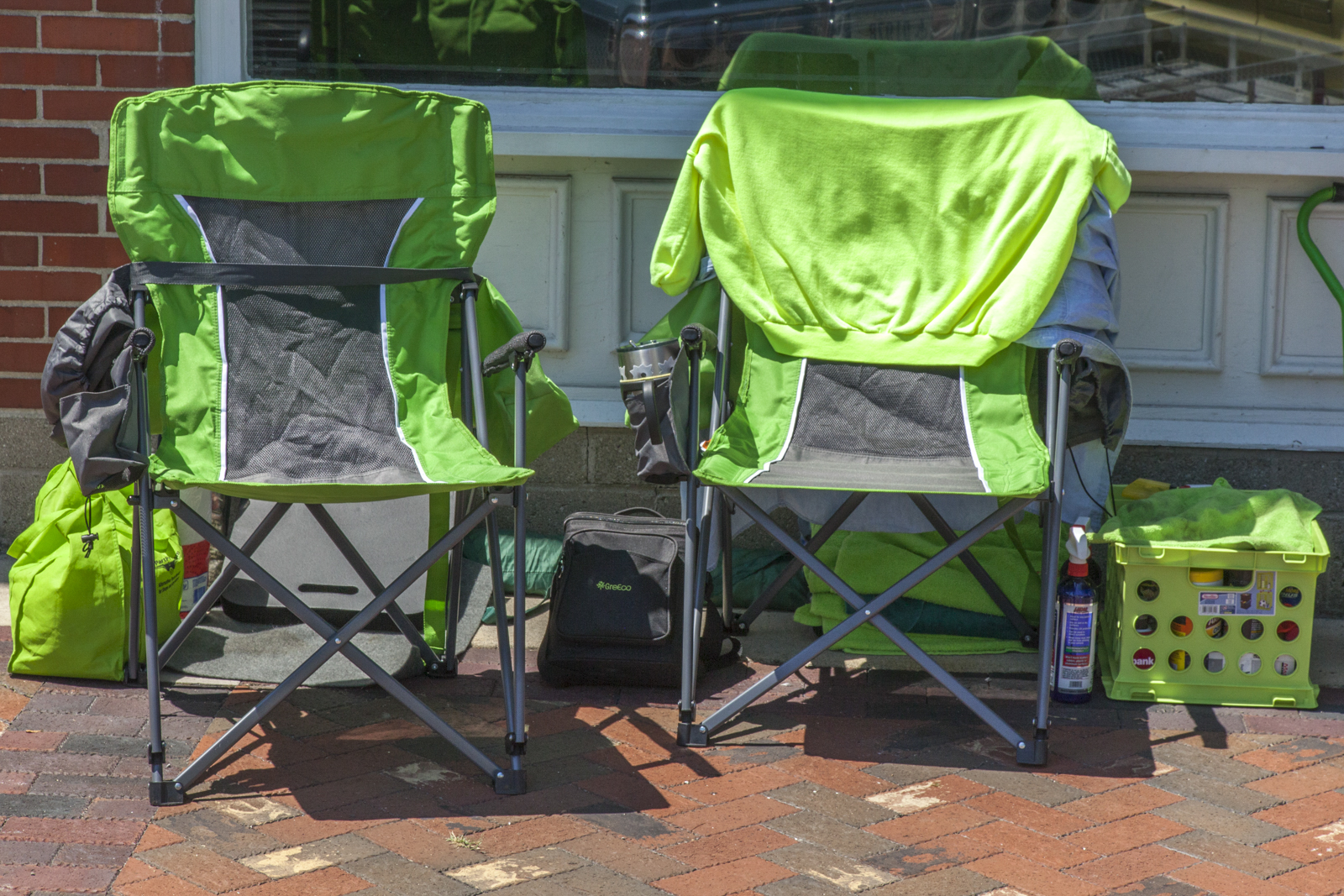
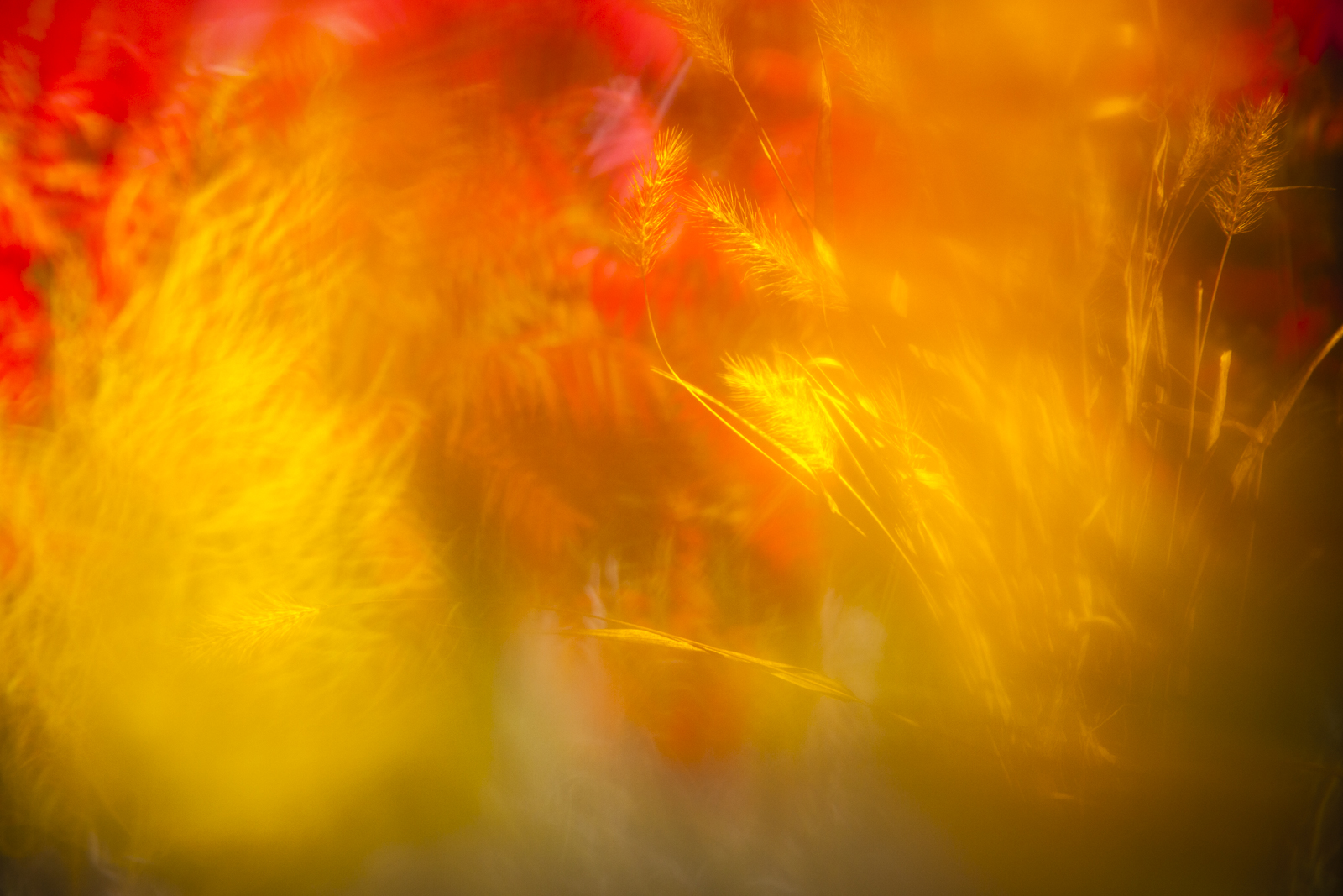
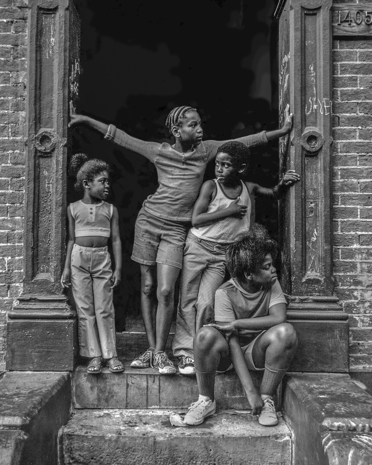
Historically, in the United States there were times of low social contrast, where there was little interest in public affairs and even less political engagement. The public’s enthusiasm was flat; the contrast range became contracted and a general malaise set in. Feeling disenfranchised and helpless, citizens largely disengaged and deferred to the preferences of their representatives. This  image represents this situation. The subject matter can be recognized, but the expression is soft lacks vitality, socially and aesthetically.

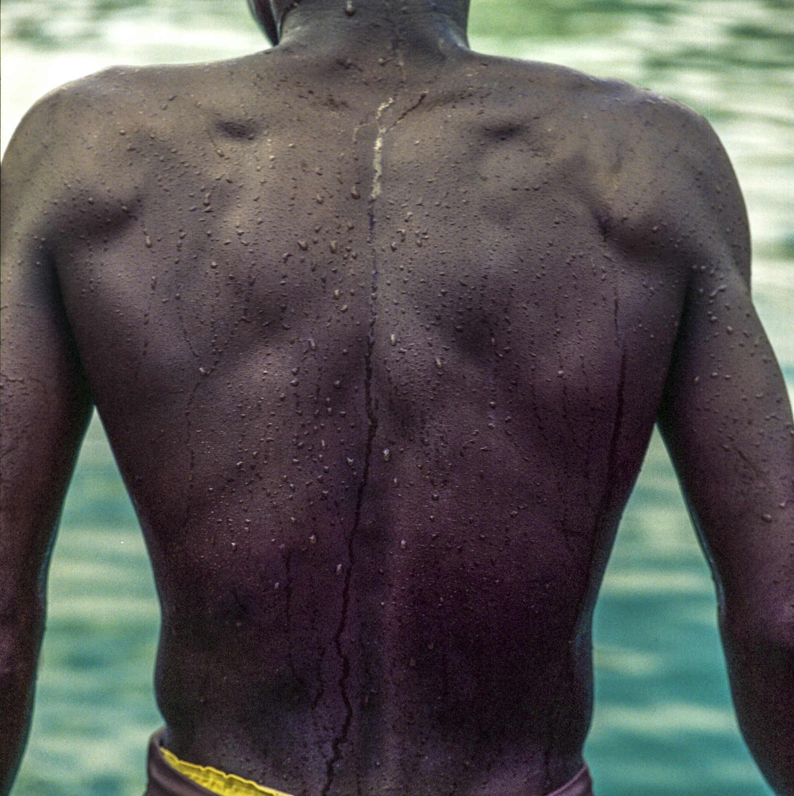
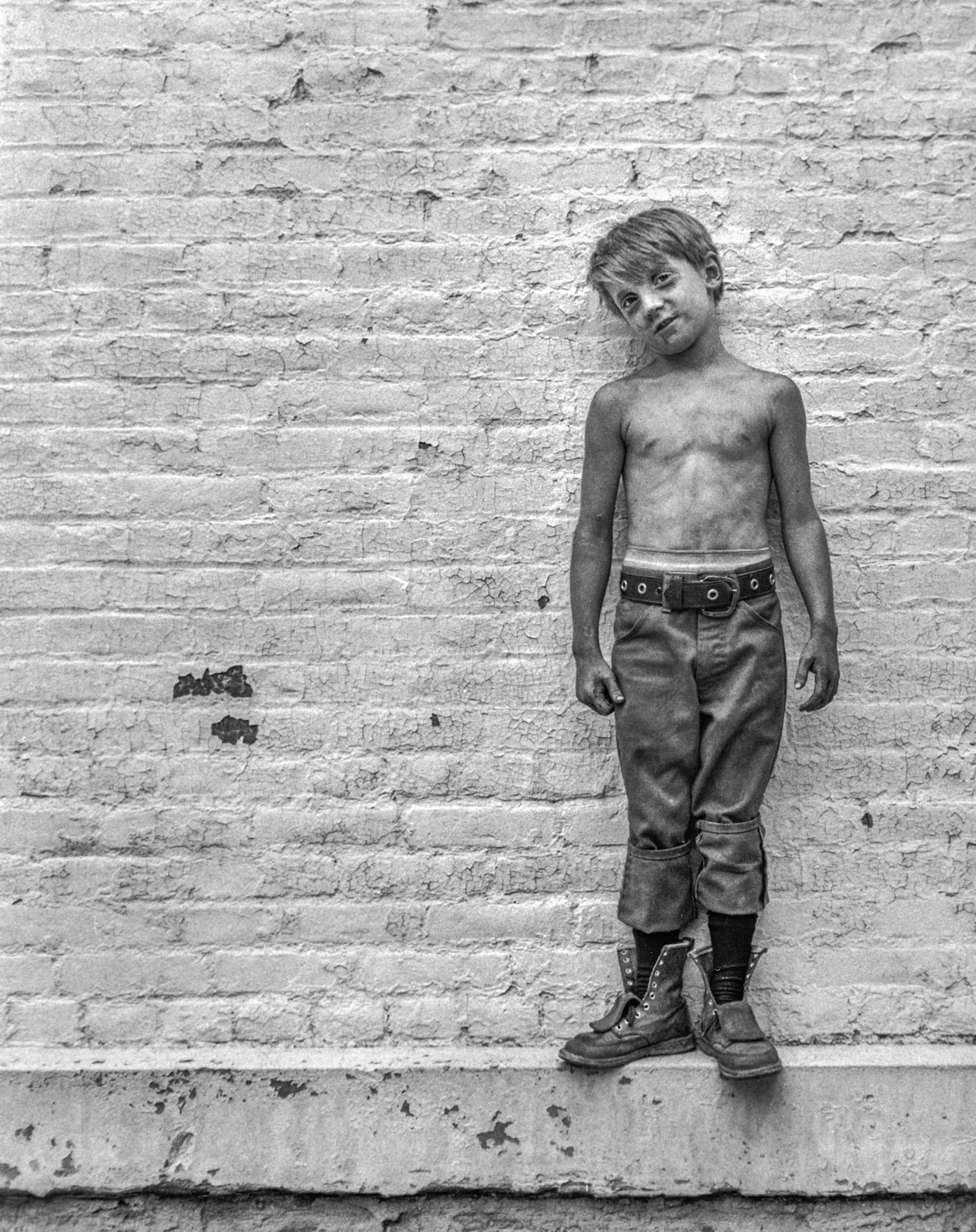
On the other extreme, when enthusiasm turns to fixated passion to the extent that neither political entity can abide the perspectives of the other, the contrast becomes stark, relationships become contentious and the whole system tends toward dysfunctionality. Pictorially, extreme political contrast identifies citizens as either a black or white pixels. You can’t be gray. Extreme contrast is militant. It says, choose your position and defend it! There’s no detail, few grey areas, no substantive perspectives or open-mindedness in either direction. (The black and white image, rather than color, stands as a metaphor extreme differences).

Episodes of Madam Secretary and Blue Bloods on television provided demonstrations of how extremely high political contrast can be reduced to a functional level. In both instances, the characters representing the extremes, fully expressed their perspectives with well-reasoned arguments making sure their positions were clearly understood. (In formal debate, the first order of business is always for the participants to define their terms). With the point of disagreement clear, the characters came together and negotiated terms—in detail—that would satisfy both. They compromised and reached a workable, win-win arrangement.

An argument is reasoned when it’s based on logical discourse that flows from evidence, statistical analysis or proven facts, as opposed to opinions expressed emotionally without supporting evidence. For instance, an argument that begins, “The American people want… or know…” is the hallmark of an unsubstantiated emotional appeal. Nations are constituted of diverse people having too many perspectives and preferences to be lumped into a single philosophical category, despite what surveys or poles might seem to indicate.

At the end of a Blue Bloods episode, Frank Reagan, the NYC Police Commissioner played by Tom Selleck, rebuilt a contentious relationship that had developed between him and his daughter, Erin Reagan, the Assistant District Attorney played by Bridget Moynahan, by citing a particularly nasty hockey game where the players on both sides shook hands after the game. Respect was regained in that situation by acknowledging that, although the game was difficult and people got hurt, the higher ideal of sportsmanship was maintained.

Social contrast, like pictorial contrast, has to be managed. In the first place, that can only happen when both extremes loosen their grip on how to accomplish a common goal. That requires the participants to have open minds. Once the goal is clearly articulated and agreed upon, the means toward achieving it have to be presented in a reasoned argument on both sides. And that requires full concentration, understanding, respectful questioning and listening with an open mind. This is the period of “illumination.” Finally, and critically important, the participants must consider the maintenance of their relationship as equally important to winning the argument. Shaking hands, having a meal together, meeting each other’s families, frequent personal interaction—these ensure that the next game will be played well.

“Thank you” to the writers, producers and cast of Madam Secretary and Blue Bloods. They are prime examples of television that’s socially responsible, showing the full range of human experience, and how the extremes can be peacefully managed.

The critical contrast between seeing and looking-at cannot be overestimated. Seeing touches the heart. Looking-at is cold hearted. The difference may be a matter of life and death.

Fredrick Franck, artist

________________________________________________________

My other sites:

Substack: Poetry and insights relating to creation and Creator

David L. Smith Photography Portfolio.com

Ancient Maya Cultural Traits.com: Weekly blog featuring the traits that made this civilization unique

The Aesthetic Dimensions in Art and Society

Chapter 5: Elements of Composition

In pictorial art, composition relates to how visual elements are organized within a frame. Through the centuries, both Eastern and Western artists developed guidelines to help them maintain a viewer’s attention. Aspiring artists and many in the public appreciate that the organization of elements within a frame influences the viewer’s experience of an image.

How does it work? How does composition contribute toward capturing and holding someone’s attention? Each of the aesthetic dimensions being treated in this series are contributing factors, but specifically related to composition are the principles of unity, balance, focus and placement. Because these rules have been confirmed as appealing to the eye across cultures, adhering to them is advisable. At the same time, they can and are often broken. My advice to students, “If you want to break the rules, do it for good reason and beautifully.”

Visual Elements and Information Theory

An eye for composition develops more quickly by regarding subject matter as visual elements, the parts of an image that together make up the whole. By enclosing space within a frame of any sort, the message to viewers is “Look here. I want you to see this.”

Imagine a dot like this ( . ) anywhere on a white background that’s framed. That’s one “bit” of information. It simply “says” it’s a black dot and it exists. It conveys no meaning because meaning derives from context and relationship. When we add another dot in that frame a relationship is established and it generates the question: “What does it mean?” The artist had something in mind, and the viewer’s challenge is to make sense of it—if they care to. Add a third dot and the potential for meaning increases dramatically. The relationship becomes more complex. Because the elements are within a frame, the viewer assumes they must be significant in some way. And that’s the context, urging the viewer to identify the subject, understand the relationship and why it’s being presented. What’s going on here?

Being human, we tend to anthropomorphize, so the three stones above could be interpreted as parents and child. Which would be the father? Actually, any of them could be, but our preconceived notions assign “him” to the larger stone because men are generally larger than women and children. The composition itself, how the stones are arranged, “speaks” as well. Notice the larger stones are touching. And why is the small one not touching the others? What might the color and differences in texture convey? What does it say that one stone has more texture than the other?

As more elements are added to an image the relationships become complex and the meaning more apparent. Each additional element—line, squiggle, circle, form or subject matter—regardless of size, shape, texture or color is another bit of information.

And the background is another. The more information there is within a frame, the more readily a viewer can discern its meaning, even perhaps the artist’s intention, mood or preferences. So what’s the story here?

Creative application

Communication Objective

To more consciously create an image that’s expressive, the consideration of composition should relate to some purpose or communication objective. What do I want viewers to see, think or feel?  Or what do I want to say? Broadly, there are two reasons why we arrange elements within a frame—to express something or provide information. Sometimes both. In practice, if the intention is to express, reduce the number of visual elements—simplicity. If it’s to communicate, increase them—complexity. Does this notion of simple/complex apply to sound as well? What about food? Architecture? Lifestyle?

Unity

In the visual sense, unity relates to appropriateness. Are the elements within the frame justified relative to the expression or communication objective? There shouldn’t be a dot, line, surface, form or anything else that doesn’t contribute to the whole statement. For instance, the impact of this photograph would be less unified if there was a kite flying in the sky.

Aesthetic unification usually requires getting in close, zooming in or changing the angle to exclude everything that doesn’t relate to the principal subject. Unity strengthens the expression and communication objective. When an image is unified, it makes a clear statement, even if it abstract.

Balance

An image is balanced within a frame when the elements are similarly “weighted” on both sides of the frame, or top to bottom. Art students are taught to think of the frame as having a fulcrum at the bottom center of the frame. Ideally, the elements don’t tip the scale on one side or the other. A balanced composition feels good; an image that’s top or bottom heavy or right or left feels “off.” It pulls the attention toward the bold or heavily weighted subject matter, making it challenging for the eye to move freely within the  frame. Of course, if the communication objective is to express a feeling of instability or attract attention through imbalance, the elements can be purposefully unbalanced. Above, the clouds and poles diminishing in size and number on the left, balance the tall, darker one on the right.

Focus

An image is compositionally focused when the subject matter is prominently placed within the frame. It’s the “dynamic center,” the point where we want the eye to go to first and return after wandering. Focus is important because it conveys the expression or accomplishes the communication objective. As the central feature and point of critical focus, it “says” what the image is about. This is generally accomplished by going in close, excluding as many secondary elements as possible. Maximizing compositional focus is why closeups are so powerful.  A lack of focus is confusing. For instance, a seascape that puts the horizon in the middle of the frame top-to-bottom could be a statement about either the sky or the ocean. Which is it?

Placement

It’s been said that the greatest compliment a viewer can pay an artist is the length of time they attend to their work. The arrangement of elements within a frame largely determines how long the viewer will stay with an image, and how their eye will move around it. In this series, all the aesthetic dimensions being considered influence that arrangement. Organization of visual elements is a skill, gained by studying the works of master image makers and analyzing our own creations to see what works and what doesn’t.

In Western cultures we read left-to-right and top-to-bottom, so the eye is best directed within a frame by having a face situated on the right of the frame looking left into the space. That way the eye enters the frame on the left, connects with the subject’s eyes, pauses and returns to the left, the direction the person or animal is looking. Were the subject placed on the left of the frame looking right, the viewer’s eye would go to the subject’s eyes and continue out of the frame on the right, shortening their attention. The rule is to keep the viewer’s attention engaged in the frame as long as possible. To do this, the elements need to be arranged so that no line, sightline or vector leads the eye out of the frame.

Eye leading and circular composition

Famous painters throughout history used “compositional flow” or “eye leading” to maintain the viewer’s gaze. Longer attention encouraged deeper engagement. Artists accomplished this by creating actual and imaginary grids to create balance and movement, the golden mean to create harmony, vectors to create visual pathways, framing devices like trees and architectural elements and circular composition to continuously guide the viewer’s eye from one element to another. Photographers working in this way often use view cameras, because composing on a 4×5 or 8×10 glass plate allows for the meticulous arrangement of elements.

The Rule of Thirds

Rule of Thirds Grid

To situate subject matter within the frame in the most pleasing way, and to better control eye movement within it, artists devised a scheme where they divided an imaginary frame into thirds to create a grid. The “rule of thirds” advises us to not place the principle subject matter dead center in the frame, instead, to place it where the lines of the grid intersect.

Sacred Geometry

An Amish construction based on the principles of sacred geometry

An example of architectural resonance

Anciently, artists discovered ways of ordering elements within a frame that evoke a numinous feeling, a sense of spiritual wholeness or grandeur. They found that certain geometric forms, those with specific mathematical properties, somehow set up a resonance within us. This aesthetic dimension is amazing and vast. I recommend a visit to a well-illustrated page in Ancient Wisdom.

Golden mean overlay

A geometric form that’s especially applicable for photographers is the “Golden Ratio,” illustrated by the spiral. It’s based on a 5:8 proportion. I use it to format images and place primary subject matter on the imaginary “sweet spot.” I highly recommend Sacred Geometry by Robert Lawlor. Its many illustrations allowed me to translate the philosophy of sacred geometry into tools for everyday use. Most libraries have the book. If you use Lightroom software you can overlay a variety of grids like this. In “Develop” mode press the “R” key to bring up the grids. To change them, press the letter “O.”

Reflections On Personal and Social Order

When objects—books, chairs, cars, buildings, neighborhoods—are ordered, they establish and display a regular pattern or sequential arrangement that looks and feels complete, managed. When all our “ducks” are in a row, they’re in a satisfying and assessable alignment. Order and disorder communicate, so we have to be careful in making judgments based on the composition of other people’s environments. For instance, a neighbor can have toys and tools scattered all over their yard, left out in the rain with weeds growing over them. And then there’s another neighbor whose toys and tools are neatly stowed in a garage or shed, leaving the grass open and well-trimmed. We may be tempted to think the former suggests an uneducated, uncaring person. Even reading these descriptions, it’s likely you formed an opinion. But the disorderly neighbor could have a Ph.D. in microbiology and sing in the church choir, and the orderly neighbor could be a radicalized individual building a well-organized collection of handguns in his basement preparing for a terrorist attack.

A principle in the anthropology of visual communication holds that “everybody notices everything.” Another is “What we see we evaluate relative to our history, experience and worldview.” And “We tend to see what we want to see.” Yet another, we find what we’re looking for.” Judgments relating to order help us place ourselves and others within a social context. On the other hand, if we let them, our judgments can create chaos, build walls of separation and encourage stereotyping. The order-disorder continuum alone, is therefore not a good criteria for making judgments about people.

Expanding the context from personal to social order, Margaret Wheatley, noted systems theorist and management consultant offered eight social principles relating to the subject of order and organizations—how we compose our lives. The following are quotes from her book, A Simpler Way.

  1. We live in a world in which life wants to happen.
  2. Organizations and societies are living systems.
  3. We live in a universe that is alive, creative and experimenting all the time to discover what’s possible.
  4. It is the natural tendency for life to organize, to seek greater complexity and diversity.
  5. Life uses messes to get to well-ordered solutions.
  6. Life is intent on finding what works, not what’s right.
  7. Life creates more possibilities as it engages with opportunities.
  8. Life organizes around identity.

Expanding the subject even further, to the nature of reality, theoretical physicist David Bohm  developed the concept of “implicate” and “explicate” orders. Using the analogy of a rolled-up carpet, he proposed that we should think of the objective or Absolute Reality as a “pattern” that already exists, complete and fully formed within the roll. The pattern is already there but hidden. We can’t see it until, in time, the carpet unrolls and the  pattern becomes visible—the reality we experience. Dr. Bohm was one of the first scientists, extrapolating from quantum theory, who theorized that reality and consciousness constitute a coherent whole that’s in a process of unfolding.

Chaos is infinitely complex order.

David Bohm, physicist

________________________________________________-

My other sites:

Substack: Poetry and insights relating to creation and Creator

David L. Smith Photography Portfolio.com

Ancient Maya Cultural Traits.com: Weekly blog featuring the traits that made this civilization unique


The Aesthetic Dimensions in Art and Society

Chapter 3: Color as Subject

Objectively speaking, the world is colorless. So is the sun. Our brains construct the sensation of color from various radiating wavelengths of photons, depending on how they’re absorbed in and reflected from various surfaces. Visible light occupies just a tiny sliver of the electromagnetic spectrum, constituted of wavelengths that stimulate our brains to interpret them as colors. We see a leaf as green because it absorbs all but the green wavelengths, which it reflects.

Light has three properties that affect the sensation of color: “hue,” which specifies a wavelength and the names we assign to its variations (red, yellow, blue). “Saturation” refers to a color’s richness (muted or intense). “Brightness” refers to its intensity.

I  want you to understand that there are no colors in the real world. There are no textures in the real world. There are no fragrances in the real world. There is no beauty. There is no ugliness. Nothing of the sort. Out there is a chaos of energy soup and energy fields. Literally. We take all that and somewhere inside ourselves we create a world. Somewhere inside ourselves, it all happens. The journey of our life.

Sir John Eccles, Australian neurophysiologist and philosopher


QUALITY

Photographers are concerned with the “quality” (color) of light because cameras don’t see it the way we do. They need to be shown or “balanced” for different wavelengths, and they do it by referencing “white.” A photo taken with the camera set at “tungsten” or artificial light, which is proper for indoor shooting, will turn out distinctly yellow when shooting outdoors with the same setting. Camera instruction manuals describe the “white balance” procedure, so the focus here is on the aesthetic considerations of color, particularly its sensibilities (harmony/discord) and the social/psychological characteristics that concern image makers. Light sources and controls were covered in a previous posting in this series: Chapter 3: Light and Lighting.

Sunlight varies considerably depending on the time of day, seasons and atmospheric conditions. Bulbs in artificial lights come in two distinct color “balances”—”daylight” (5500 to 5600° Kelvin), which approximates sunlight falling on a white card at noon on a clear day—sometimes used indoors to simulate daylight conditions. And “tungsten” (3200° Kelvin), which is commonly used in studio settings. Working under either of these conditions, our eyes adjust and these bulbs appear to emit normal white light. But side by side, a tungsten bulb would obviously emit orange light compared to a daylight bulb, which would be distinctly blue. Color films have long been available in both sensitivities.

CREATIVE APPLICATION

Any image, black and white and color, can be perceived as being “simple,” having few visual elements, or “complex” having many. Generally, image simplicity tends to be more expressive and evocative, whereas complexity provides more information. A related feature specific to color is the phenomenon of harmony and discord. An image displays “color harmony” when the hues within the frame are close to each other on the electromagnetic spectrum. They can vary widely in saturation and brightness, but overall the image will consist of blues, reds, greens or yellows. With even a cursory glance at such an image, a viewer will readily see it as predominately “orange,” “green” or “blue.”

Color Harmony

Application

Color harmony is used when the expression or communication objective is to attract attention or evoke a mood. It accomplishes this by being unusual. In our everyday experience of the world, indoors and out, there are so many objects of different colors it’s relatively rare to find subject matter with harmonious hues. Of course, in the studio it can be created. Whenever photographer’s see it, it catches their attention. It’s a pleasing sensation.

Out in the world with a camera, it’s sometimes a matter of shooting close and framing the shot to exclude hues different from the primary subject matter. In the studio, it’s a matter of choosing a background, foreground and other elements that are the same relative color as the primary subject, irrespective of saturation and brightness. This aesthetic dimension is effective when the intent is to create impact or generate an emotion. 

The most important aesthetic principle (for the Japanese) is harmony—harmony of forms, colors, and materials, harmony of expression, harmony of order, harmony of place and time; harmony of heaven, earth, and man; harmony of harmonies.

Hasumi Toshimitsu, author Zen in Japanese Art

Color Discord

Application

Aesthetic discord is the opposite of harmony. It’s where there are several different hues in the same image. Because it’s the visual norm, it’s much less challenging than harmony to find and produce. Used deliberately, it works best when the intent is to convey information rather than express or elicit an emotion. It accomplishes this by making each color a distinct and separate visual element. Complex images—those having many elements and colors within a frame carry more information potential. If desirable, discordant colors can also evoke a sense of clutter, frenzy or confusion. Jeffrey Becom, who focuses on the architecture of various cultures, provides stunning and beautiful examples of color discordance. Clearly one of his primary aesthetic preferences is bold and contrasting colors.

Color is evocative. One of the items in my creative toolkit is a chart of the psychological properties of different colors. It helps me make decisions about costumes, backgrounds, lighting and props. And in video post-production sessions, it helps to select fonts and graphics that pick up product colors to make things harmonious.

Whatever we’re creating, even if it’s words on a page or putting together a gift for someone, colors “speak.” They can create an affect, leave an impression and symbolize an emotion. Because they’re components of the visible portion of the electromagnetic spectrum, the hues have both higher (darker) and lower (lighter) vibrations. With regard to evocation, the key question is: What do I want people to feel?

RED is masculine, aggressive, stimulating and lively. It can signal passion, courage and strength. Depending upon the context, deep red can be aggressive and defiant. “Fire engine red” is my favorite color for creating excitement.

BLUE is intellectual, the color of mind. Its lower (lighter) vibration evokes trust, serenity, reflection and calm. Strong blues stimulate clear thought and soft blues are conducive to consideration and reflection. It’s why I chose the calm blue of a lake for the masthead of this blog. Dark blues can express coolness or aloofness.

YELLOW is emotional, the color of optimism, friendliness and creativity. Bright yellow is open, encouraging and inviting. On the dark side, bordering on brown, it can promote feelings of fear, depression and anxiety. When a product, message or scene needs to convey a sense of confidence or trust, bright yellow is a good choice.

GREEN is the color of balance and harmony. It conveys the sensibilities of peace, awareness and freshness—like an expanse of verdant grass. We have a natural affinity for green because it signals life, the presence of water and the potential for food. Dark greens, however, can express stagnation or sameness.

VIOLET on the lighter side is spiritual, the color of awareness, vision and truth, even luxury. On the dark side it can be cloying and annoying, the vibrance being so strong it borders on decadence or suppression.

ORANGE is playful. It reminds us of food, fruit in particular, so it contributes to feelings of comfort, abundance and security. On the bright side, it photographs well in ads that contain food. Think of seafood commercials. Along with red and yellow it’s one of the “fun” colors used to enhance motivation. Deep dark tones of orange can convey the opposite—deprivation.

BROWN is serious, referencing both the earth and decay. It can convey stability and warmth. Browns excel in autumnal images and ads that feature furniture, leather goods and high fashion.  Its dark (higher) vibration can express heaviness, even depression. It doesn’t photograph well in ads containing food.

THE SOCIAL SIGNIFICANCE OF COLOR

There isn’t an object or experience I can think of that isn’t influenced or enriched by color. It’s a primary influence in the food we eat, the automobiles and appliances we purchase, the vacations we take, the creative activities we perform. We use it symbolically to distinguish differing political views, moods, traffic signals and road signs. Businesses—Target stores (Red) and UPS (Brown) trucks—can be identified solely by their color. And colors carry different meanings across cultures. White symbolizes purity in Western weddings but mourning in many Eastern traditions. Red signifies luck and prosperity in China, while in the West it can imply danger, love or passion.

It plays a defining role in identity, from national flags and political movements to sports teams and religious vestments, such as Catholic cardinals wearing red, the color of hierarchy . LGBTQ+ communities use the rainbow flag as a symbol of diversity and pride. There are “red states” and “blue states,” expressing political views.

Perhaps the most socially significant color is that of skin tone. It has led to systemic racism and wars with geographic, political and economic consequences worldwide.

I see a time of Seven Generations when all the colors of mankind will gather under the Sacred Tree of Life and the whole earth will become One Circle again.

Chief Crazy Horse, Lakota war leader of the Oglala band

What we wear communicates status, mood and affiliation. Bright, bold colors may signal confidence or rebellion; subdued tones may suggest conformity or solemnity. Uniform colors in workplaces (e.g., blue scrubs in hospitals and uniforms in law enforcement) denote roles and responsibilities. Bottom line: Color communicates!

Color is a power which directly influences the soul.

Wassily Kandinsky, Russian painter and art theorist

_____________________________________________________________________

My other sites:

Substack: Poetry and insights relating to creation and Creator

David L. Smith Photography Portfolio.com

Ancient Maya Cultural Traits.com: Weekly blog featuring the traits that made this civilization unique

The Aesthetic Dimensions in Art and Society

Chapter 3: Light and Lighting

Regarding the mystery that light is, physicist Arthur M. Young wrote in The Reflexive Universe: Evolution Of Consciousness, “Light, itself without mass, can create protons and electrons which have mass. Light has no charge, yet the particles it creates do. Since light is without mass, it is nonphysical, of a different nature than physical particles. In fact, for the photon, a pulse of light, time does not exist. Clocks stop at the speed of light. Thus mass and hence energy, as well as time, are born from the photon, from light, which is, therefore, the first kingdom, the first stage of the process that engenders the universe.” Because light is central to image making, those working with it pay attention to its characteristics, at times selecting and altering different sources and light shaping instruments according to their expressive need, intention or communication objective.

SUNLIGHT

Sunlight is not just illumination—it’s a dynamic, emotional, and symbolic element that can shape the entire mood and meaning of an image.

Direction

Hard: Cloudless mid-day sun creates high contrast with deep shadows that have sharp edges.

Soft: Clouds, fog and mist spread the light to create blurred shadows, if any.

Front light: Tends to flatten forms but can enhance color saturation.

Side light: Enhances textures, form and depth.

Back light: Silhouettes and halos; enhances patterns in translucent material (leaves, fabric).

Top light: Mid-day sun can be harsh, stark.

Color

Magic Hour: Just after sunrise and before sunset; warm, amber glow, long shadows.

Blue: Before sunrise and after sunset; cool, moody tones; calm and quiet.

Mid-Day: Neutral; emphasis on information rather than expression. 

Symbolism

Sunlight can evoke a perspective on the immensity of the earth and cosmos, and signal enlightenment, transcendence, revelation or the divine. 

ARTIFICIAL LIGHT

Film and digital image makers rely on variety of light sources and light shaping instruments. A primary consideration is the relative sharpness of shadows, ranging from highly “specular” to very “diffused.”

These bulbs were lit from the side to cast shadows. The source was a clear 200W bulb, identical to the one shown at top left. Being a specular source, the edges of the shadows are sharp.

  • Top left: Clear, 200 watt incandescent bulb with 2 1/2″ filament (specular)
  • Top middle: Frosted LED bulb (very diffused)
  • Top right: 200W frosted incandescent bulb (diffused)
  • Middle: 250W clear quartz halogen bulb with 2 1/2″ filament (bright ‘ very specular)
  • Bottom left: 500W frosted quarts halogen tube with 4″ filament (very bright and specular)
  • Bottom right: Clear 250W quarts halogen bulb with 1/2″ filament (extremely bright). Of those shown this bulb yields the highest degree of specularity because its filament is so tiny.

SPECULAR LIGHT

A light source is considered “specular” when it’s not modified by any kind of diffusion material. The tinier the filament, the greater the degree of specularity. The telltale sign of these bulbs is the sharpness of the shadow they cast. The sharper the edges, the greater the specularity. Highly specular lights are commonly used in jewelry store ceilings, windows and counter displays to create sparkling highlights in the facets of gemstones and metals. In this light, their slightest movement makes them sparkle.

Professionally, quartz (tungsten-halogen) bulbs have been the standard for many years. They have excellent color consistency and they cost less than LEDs, which emit very little heat, are safer, use less energy, last longer, can vary in color and are lighter than quartz to transport. But unlike quartz bulbs, which can stand alone, LEDs require a special fixture or focusing device to make them emit a specular beam. And that increases the cost.

CAUTION: Never touch a quartz bulb with your fingers. When the bulb lights, the oil from fingerprints instantly melts and the bulb explodes. Early in my career as a cinematographer I witnessed this once. It sounded like a shotgun going off. No one was hurt, but shards of molten crystal burned for several minutes into the wood desk they landed on. In the industry, as a safety precaution, whenever someone is about to turn on a quartz light where people are close by, the practice is to first turn the light away and call out “comin’ up!” In nearly three decades of working with students in a studio setting where all the lights were fitted with quartz bulbs, not once had there been an accident. Quartz bulbs are excellent, but they have to be handled with care. 

Creative Application


Because specular lights produce hard-edged shadows and crisp highlight, they enhance detail and texture, especially when directed from the side; the more to the side, the longer the shadows. This makes them ideal for emphasizing rugged skin and beards, fabrics and weathered surfaces such a driftwood and peeling paint. In portraiture, it’s common to use a specular light as a “kicker” or “backlight” to create a sense of depth by separating the subject from the background. It also contributes to the modeling of form in architecture, fashion and product photography. Emotionally, specularity shouts; it’s not subtle.

Specularity is employed when the expression or communication objective is to create a sense of “brightness” or “crispness,”—and increase the sensibility of texture. Unlike most of the other aesthetic dimensions that express either emotion or information, specular lighting accomplishes both at the same time.

DIFFUSED LIGHT

The more diffused the light, the softer the look. It’s desirable in both expressive and commercial situations, especially in the realms of glamour and fashion. The softening effect is heightened by having a diffused source positioned above the subject, whether people or objects. As seen here, however, with the light more to the side, the graded shadow on the opposite side of the rounded form is spread longer. The light on this bowl grades downward from the rim. Diffuse lighting, whether indoors or out, is warranted when the expressive intent or communication objective is to emphasize the emotional sensibility of smoothness, roundedness or depth. It’s not so good at providing information.

Compare this image with the one above. It’s the same photo as the one displaying specular light bulbs, only this was lit with a diffused source. Notice how the edges of the shadows are softened, blurred and graded. When there is anything behind or in front of a filament, be it  metal or plastic, the light becomes softer with spread out shadows. The denser the diffusion medium—clouds, fog, diffusers, colored gels—the fuzzier the shadows. Any kind of coating on a bulb or tube diffuses the light. Fluorescent tubes are almost always coated, commonly used in large areas such as department stores and offices to soften the look of fabrics—and they’re easier on the eyes. Upscale restaurants use diffuse and dimmed lighting to create a soft ambiance. The electric candles on tables usually have small lampshades to diffuse the otherwise specular bulbs.

Creative Application

Diffuse lighting is subtle and soft, revealing without overpowering. It wraps around subjects with graded shadows and reduced contrast, creating a more contemplative sensibility. It’s ideal when the intent is to create a feeling of flow, softness or subtle moods. Considering the unsharp shadow edges, highlights and shadows are closer in tone. Whereas specular lighting shouts, diffuse lighting whispers. For these reasons, it excels in expressing emotions and conveying beauty.

Tools

Photographed with permission at Dodd Camera, Cincinnati, Ohio

The industry that serves professional image makers has developed an enormous verity of lights and light-shaping instruments designed to create various sizes and levels of diffusion. These include softboxes, diffusion panels, umbrellas and materials such as translucent sheets of plastic, frosted plexiglass and wire frames that attach to lights. Ordinary white foam core also serves as an inexpensive reflector. Another way to create diffuse lighting is to bounce lights off a white wall or ceiling.

Painting with Light


Kenwood Baptist Church, Cincinnati, Ohio

At night, I set the camera on a tripod with the aperture at f16 and the shutter set for a time exposure. After opening the shutter I walked around this property setting off bursts from an electronic flash. I made 15-20 flashes in the space of five minutes, constantly moving with my back  to the camera and the flash unit in front of me. Finally, I laid on the ground and pointed the gun upward to the tree. The huge stained glass window was the only thing that was actually lit. I hadn’t expected the tree limbs to be blurred, but I liked that it gave the image a sort of haunting sensibility.

 Light as Subject

There’s a quality of light that plays a prominent role in defining form, not just revealing it. Beyond allowing a subject to simply be identified within a frame, it touches the aesthetic nerve, evoking an appreciation of the essence or spirit within or beyond the form. Whether in color or black and white, these images are predominantly black allowing the light to take center stage.

REFLECTION

“Light” is a common metaphor for awareness. We picture a lightbulb and say we had a “bright idea.” And when Indian sages attain realization, they speak of it as “illumination.” Basically, the metaphor expresses a new or heightened state of awareness or consciousness. Considering the recommendation to pay attention to what the light is doing in order to create an image; questions comes to mind regarding the place of light in everyday experiences—our frames of reference.

What are my thoughts doing? Along what lines are they being directed? Where am I “pointing” my attention (the camera equivalent)? Am I creating the reality I want—by purposefully managing my attention? Or am I allowing it to be directed by outside influences? It’s the difference between directing and reacting, living authentically, consistent with one’s purpose, or operating on auto-drive.

This prompts another line of questioning: What images am I creating—and what am I doing as a result of those images? What are the consequences of what I think about most? It’s good to know because whatever we attend to we make more of. There’s no right or wrong, better or worse here. Whatever is consistently on my mind and paying attention is what I’m bringing into my life and contributing to the world.

Increased awareness of a light source, its qualities and functions in our lived spaces as well as in photographic image making, deepens our appreciation for the capacity of sight. Had evolution not provided the combination of eyes to collect certain photon frequencies and brains to interpret them, we would only be feeling the radiation that comes from the sun—and every other source.

Light created the eye as an organ with which to appreciate itself.

Johann Wolfgang Goethe, Poet, statesman

Light is energy and it’s also information, content, form, and structure. It’s the potential of everything.

David Bohm, Theoretical physicist

______________________________________________

My other sites:

Substack: Poetry and insights relating to creation and Creator

David L. Smith Photography Portfolio.com

Ancient Maya Cultural Traits.com: Weekly blog featuring the traits that made this civilization unique

The Aesthetic Dimensions in Art and Society

Chapter 2: Atmosphere

Atmos is a Greek word meaning “vapor.” Sphaira means “sphere.” Combined, scientists use the word “atmosphere” to describe the layer of gases surrounding a planet, held in place by gravity. Artists have long understood that atmospheric effects contribute to the emotional tone of a painting or photograph. Misty variations in light and shadows with shifts in color create a softening effect and enhance the feeling of depth. Because fog and mists are constantly changing, there’s also an underlying sense of movement. In particular, still photographs capture and hold these fleeting moments. Aesthetically, atmosphere is a core element in expressive photography.

CREATIVE APPLICATION

Whatever the lighting conditions, it’s the reduction of image acuity or sharpness that produces the softening effect. When the atmosphere is thick and variable, it can become a major feature of the image, even frame and contextualize the primary subject.

Spread evenly across the frame, atmospheres serve as a kind of background. Outdoors, the time of day and conditions determine the color and the extent of diffusion—yellow on clear mornings, blue when it’s overcast. Because atmospheric effects are so weather dependent and variable, photographing at specific times and locations are hard to plan. When ask the secret to his success, street photographer Henri Cartier Bresson famously replied, “Be there and f8.” For something wonderful to happen in front of the camera, we have to be somewhere.

Advertisers and other designers use atmosphere to evoke emotion and beauty. They understand that consumers are attracted to products associated with a certain look, lifestyle or experience. It’s why, on television, glamorous models are used to sell perfume and trucks are shown on deserts and off-road mountain tops. Due to the purposeful lack of acuity, atmospherics contribute to creative expression, but are generally not favored by professionals when the communication objective is to provide information.

TECHNIQUE

Outdoors, atmosphere takes the form of condensation, precipitation or particulate matter such as steam, smoke, fog or smog. One of my favorite times to photograph is when the temperature changes quickly in the morning so the fog is dense and flowing. This can be anticipated by watching weather reports for days when there are extreme shifts between late and early morning, where the humidity is near 100% and when the temperature rapidly drops at night. Ahead of time, we can prepare for fog by taking notice of low-lying areas near water.

Having selected a location miles from home, I arrive in the area a day before, settle into a place to stay and drive around shoot through “magic hour”—golden sunlight until dark. I get up very early, find a spot near water and photograph from sunrise until the atmosphere clears. That gives me three-to-four hours of shooting atmospherics.  In fog, elements close to the camera are sharper. With distance, color saturation can diminish and blurring increases to produce a veiled or muted effect.

With the aperture stopped way down and a long exposure, the fog overlaying the distant tree line stayed sharp. The greater the distance, the more atmospheric fog becomes blue and then purple.

Atmospheric images can be created indoors. Working in my basement studio, I positioned a clump of weeds in front of a desktop computer that displayed a photo of storm clouds taken in South Dakota. The clouds were sharp, so to create the effect of distance I set the camera’s aperture to wide open, thereby reducing the depth of field between the weeds and the screen. When using a computer as a background, the room needs to be dark to eliminate reflections and the focus has to be slightly off, so the slight texture of the screen doesn’t show.

Atmospheres Characteristic of Place

Dr. Albert Sabin, developer of the polio vaccine

The atmosphere of a place is its “sensibility,” the impression we get when we enter a space. When shooting interiors, “hard” surfaces can be softened with diffused lighting, generally from above or at the camera position. Here, I bounced a 250W quartz light off a corner of the ceiling. The resulting shadows from the wooden racks are blurred and serve as vectors pointing to Dr. Sabin. Another light, placed high behind the camera with a diffuser—to simulate a ceiling light—softed his skin tone and kept the shadows of his coat very soft.

On the other hand, a soft-looking interior can be made to sparkle by shooting at night and using a single, specular source. In this case, an unfrosted quartz bulb. Diffusion decreases contrast and softens; specularity increases contrast and detail.

Social  Reflection

Socially, the term “atmosphere” refers to the emotional and psychological sensibility of a place or event. It’s not only the feeling we get from a space. Taking in the lighting, sounds, colors, odor and decor, we make judgments about the consciousness, values and temperament of the person or persons responsible for it.

My master’s dissertation in Communication Arts demonstrated that a group of diverse strangers entering a vacated residence could accurately describe the homeowner’s interests, educational level and values on standardized tests. How would you characterize the sensibility of this room? How does it make you feel? Welcome or not? Comfortable or not? What does it “say” about the person who manages this  space?

Consider a restaurant where the floor is concrete, the chairs are hardwood, utensils are plastic, walls are bare and loud music makes conversation difficult, with one where the silverware is wrapped in cloth napkins, the seats are padded, the lighting is soft and acoustic wall coverings dampen the sound of conversations with only a hint of music.

There are “hard” and “soft” atmospheric spaces. Some are simple, others complex. All of them reflect the purpose and thinking of those who created, organized or managed them. This holds for businesses and entertainment venues, wherever people gather. There’s no right or wrong, better or worse. People get married at City Hall, in a church, at a Los Vegas wedding chapel, in a garden or a sailboat. Different spaces appeal to different people for different reasons. Astute photographers, understanding the significance of atmosphere, use it to advantage.

As human beings who seek a variety of experiences, many of us, at one time or another, explore the full spectrum of available atmospheres. Growing up, I enjoyed vibrant atmospheres, loud with lots going on. Now, I decidedly lean toward places that are quieter, softer and calm, more inspirational than informational, more meaningful than entertaining. If we care to notice, indoors and out, every place communicates.


A happy life must be to a great extent a quiet life, for it is only in an atmosphere of quiet that true joy dare live.

Bertrand Russell, philosopher


My other sites—

David L. Smith Photography Portfolio.com

Ancient Maya Cultural Traits.com

The Aesthetic Dimensions in Art and Society

Chapter 1: “Abstract” and “Abstraction”

Introduction to the 13-part series

The Soul of Photography chapters provided insight and guidance about the function of the aesthetic dimensions relative to creative expression. This begins a series that elaborates those features (“atmosphere,” “contrast,” “gradation,” etc.) with an emphasis on application and technique. Also, I’ll show how the terms of these dimensions apply to the dynamics of social interaction.

The value of identifying one’s aesthetic preferences

As noted in the introduction to The Soul of Photography, by being aware of our aesthetic preferences we can more readily determine the locations, subject matter and situations where our favorites or a combination of them can be counted on to produce satisfying, often exciting, results. If these qualities are not found outside, they can be created at home or in the studio. Not knowing our preferences, we could be shooting haphazardly. That can work too, but if we want to succeed more often in creating images that work, those that feed the soul, knowing them saves time, energy and money.


The Aesthetic Dimensions in Art and Society

Chapter 1: “Abstract” and “Abstraction”

Abstract

Abstract thinking developed between 50,000 and 100,000 years ago. Anthropologists and sociologists consider it to be one of the key traits in modern human behavior, closely associated with the development of language.

It lets us plan for the future, use symbols, create and understand art, religion and science, solve complex problems and form social and moral frameworks. And importantly, it encourages us to imagine. For instance, it’s relatively easy for us to get a sense of “diverse community” in this image of diverse thumbtacks. Language itself is an abstraction, representing objects, ideas and emotions. For instance, the word “Happiness” is abstract, referencing a state of being. Even the word “community” is abstract, referencing a kind of social grouping. Fundamentally, abstract thinking expands human consciousness beyond the immediate and tangible, which is one of the benefits of making and sharing works of art.

The universe is constantly moving in the direction of higher evolutionary impulses, creativity, abstraction, and meaning.

 Deepak Chopra, Indian American author

Artists and visual communicators use abstract imaging to capture and hold our attention. Subject matter that’s abstract may not be readily identified, so people linger with an image in order to understand what they are seeing—and try to understand something about the artist’s motivation. They’ll wonder: “What is this? Does it mean something, or is it just a pleasing image? What was the artist trying to convey?”

When an image is unconcerned about literal depiction, it’s regarded as “abstract.” Such images allow the artist to perceive beyond the real, create from imagination or feelings and often just to play. They hide the artist’s intent and in the process may create a bit of confusion for viewers, which is ideal for holding their attention. I’m reminded of the movie, L.A. Story where Steve Martin, confronting an abstract sculpture exclaimed, “What kinda deal is this?” 

Sometimes, the meaning of an abstract image is suggested by its title, an explanation or the artist’s statement. For example, knowing that this is a fender on a 1974 Javelin probably satisfies your curiosity.

I found I could say things with colour and shapes that I couldn’t say any other way – things I had no words for.

Georgia O’Keeffe, artist

Abstraction

“Abstractions” bear some resemblance to the real world, so the subjects are more readily identified. Rather than represent reality, they incorporate elements of shape, color, line and composition to tangentially suggest the subject, allowing viewers to see with their minds as well as their eyes to determine what’s going on. Here too, typical of the inductive approach to image making, a particular image invites the viewer to make a general observation about the real world.

Like a good poem, a good abstraction attacks your feelings before your understanding. Abstraction within realism adds zest and excitement to otherwise dull subject matter.

Robert Genn, Canadian artist

Creative Application

In photography, abstraction is an excellent tool to use when the expressive intent or communication objective is to capture and hold the viewer’s attention beyond the subject’s identification. This is particularly the case when the photographer wants to challenge viewers to work a little harder to identify the subject and derive deeper meaning or significance. Because abstract and abstraction are largely a matter of minimizing easily recognizable features, they are best at expressing emotion and metaphors—and sparking philosophical discussions. They are not good at providing information.

Technique

Aside from going in close, shapes, forms and colors can readily be found in nature and in man-made objects using a closeup lens. Using image editing software, realistic photos can easily be manipulated to produce abstractions and non-referential abstract images.

Social Reflection

Psychologist Carl Jung wrote about abstract thinking, feeling, sensation and intuition. In each instance he said the process is inductive, requiring the rational-logical mind to assimilate and process particulars in order to reach a more comprehensive understanding or feeling. In whole-systems terms, it’s the relationship of parts to a whole, ordering them in ways that produce a concept, picture or sensation. Inductive process is higher order thinking, because it perceives or synthesizes a whole greater than the sum of its parts.

The same is true in social relations as an organizing principle. In Nation Formation: Towards a Theory of Abstract Community, Paul W. James argues that “A nation is an abstract community bringing together strangers who will never meet, resulting in real but abstracted and mediated relations—as opposed to personal relations.” At election time the American social climate becomes supersaturated with abstract labels such as “liberals,” “conservatives,” “nationalism,” “democracy,” “socialism.” If asked, twenty people in separate rooms would provide twenty different opinions on what these words mean.

Even the guiding principles of the United States Constitution are expressed in abstract terms—purposefully to allow for interpretation, which ensures vigorous debate in a two party system. Abstract terms such as “liberty,” “freedom,” “justice,” “welfare,” “prosperity,” are polarizing because there’s not a common understanding of their meanings. Politicians are adept at using abstract language to gain votes because they make for quick and emotional “sound bites.” Likewise, words like “civility,” “great,” “integrity” and value judgments such as “corrupt,” “out-of-control” and “fake” are never defined—and the lack of evidence suggests (erroneously) that the speaker mist have solid information.

Pay attention to minute particulars. Take care of the little ones. Generalization and abstraction are the pleas of the hypocrite, scoundrel, and knave.

 William Blake, English poet and painter

Social Application

Photographers can document, critique and raise awareness about social and environmental issues by capturing images that expose hypocrisy, document protests and the effects of political decisions on their communities. Visual metaphors and symbolism can challenge or reveal hidden truths, and abstractions can increase awareness of political and environmental issues. Possible applications include the creation of themed and community-centered exhibitions, publication in issue oriented magazines, collaboration with investigative reporters across media platforms, posting images and commentary on social media and offering images to support activists, NGOs and grassroot movements.  

One of the principal tenets of whole systems science says, “The whole organizes the parts.” The overall system dictates how its components behave, rather than the parts independently determining the system’s properties. For instance, the needs of the human body dictate how each organ and the cells within them function; a kidney cell in a heart couldn’t perform according to its design; companies organize their employees by assigning roles and defining objectives. On a broader scale, democracies manage their citizens, departments, corporations and other organizations through constitutions, laws, cultural norms, political structures and shared values.

The purpose of abstraction is not to be vague, but to create a new semantic level in which one can be absolutely precise.

 Edsger Dijkstra, Dutch computer scientist, software engineer, scientist

__________________________________________________________________________________________

My other sites:

Substack: Poetry and insights relating to creation and Creator

David L. Smith Photography Portfolio.com

Ancient Maya Cultural Traits.com: Weekly blog featuring the traits that made this civilization unique

The Soul of Photography

Invitations

This is the final posting in The Soul of Photography series. Next week begins the follow-on practical series, The Aesthetic Dimensions in Art and Society, which for 13 weeks characterizes the many dimensions—abstraction, atmosphere, contrast, form, key, geometry and so on—with an emphasis on technique. The series is intended to increase one’s aesthetic awareness toward the development of a unique and artistic “eye.” While the focus is photography, the information and insights apply to all other visual artforms.

Also, I invite you to visit my Substack site, the platform I use to express my love of creation and the Creator, generally in poetic form.

Thank you for following Contemplative Photography!

Chapter 10: Authenticity and Style

We all see the world differently, the consequence of diverse family histories and influences, formal education, peer associations, work relationships, readings and life experiences. When we begin to see that a camera can be used, not only to “take pictures,” but also to “make photographs” that express our thoughts and feelings, the challenge is to learn how it works technically and aesthetically. The technical part is relatively easy—purchase a high-quality camera and experiment with the various functions described in the instruction manual. The development of our  unique aesthetic sensibilities takes longer and requires sustained motivation, but it’s the foundation for expressive and contemplative approaches to photography.

A common first step in photography is to experiment with special effects. They’re fun and the results can be exciting. Then comes a period of looking at the works of established and well-known photographers, in part to emulate their works and also to be inspired by their stories.

Wanting to learn more, we turn to various resources to understand how the great painters used composition, perspective and sacred geometry to hold and move the viewer’s attention within a frame. All this is part of the process of developing an aesthetic that works.

Being recognized, published or handsomely paid for photographs is one good reason for photographing. But there are many others. The approach described in this series is about using photography as a medium for personal growth and spiritual development. It’s a continuing process of self-discovery directed toward expanded perception, deeper understanding of self/Self and improved expressions of love and appreciation for what is.

The development of this kind of aesthetic begins with an understanding of our purpose in life—What am I here to be on this planet? What have I come to do? Why photography? What does it do for me? The following steps ensure that creative works are authentic, emanating from purpose.

STEP 1. The question of purpose is the most fundamental because every other substantial question in life should flow from it. The only way I know to address this and the other questions is by consulting the higher Self (soul) in meditation.

STEP 2. In a semi-meditative state, conduct a Gifts Inventory. Create a list of the gifts (talents, skills, understandings and capabilities) you were born with, and those you’ve developed up to the present. Prioritize these in order of importance to you.

STEP 3. Discover your unique set of aesthetic preferences by recognizing the prominent patterns in your work over time. I’m not referring to subject matter. These are the visceral  “sensibilities,” the aesthetic dimensions that feed your soul. As such, they constitute your “style.” To clarify, her are some links to well-known photographers to illustrate their aesthetic preferences. To identify yours, subscribe now because next week begins a 13-week series—The Aesthetic Dimensions in Art and Society—designed to do just that.

Ansel Adams: sharpness, wide depth of field, high contract

Ed Weston: simplicity, form, geometry

Annie Leibovitz: ambient light, vivid color, painterly composition

Jeffrey Becom: color discordance, geometry, flat design

Imogen Cunningham: bold design, form, pattern, simplicity

My preferences include exquisite light, simplicity, gradation and geometry. I think it’s obvious in my images. Once the visual qualities that consistently feed your soul are understood, you’ll be able to look for locations, situations and subject matter that provide opportunities to exercise one or more of your preferences.

STEP 4. Look at your Gifts Inventory alongside your Aesthetic Preferences—as best you know them. Write down the most important items and examine them. It’s very likely you’ll see which of your gifts you can activate in order to maximize your joy and fulfillment in photographing.

STEP 5: Contemplation. Sit with a favorite photograph and delve into it. Ask what it reveals about the world, humanity, the culture and you. It could say a lot, so take notes. The insight you gain about yourself, and your preferences—technical and aesthetic—constitutes your “style.” It will make your work authentic and satisfying because it feeds your soul.

Authenticity, which in the arts means at the most profound level communion with another human soul, is something we are destined by evolution to want from literature, music, painting, and the other arts.

Denis Dutton, philosopher of art, media activist

The soul of photography lies in the urge to create images that reflect and reveal our true self and express the full range of human thought and emotion. Ultimately, the underlying trajectory and consequence of authentic creative expression is the evolution of human consciousness. Each of us makes a contribution to that by how we think and create.

By contemplating a beautiful work of sacred art, one may momentarily remember the silent center of mystery that is our very soul.

Alex Gray, artist

The Soul of Photography

Chapter 9: Connecting to Spirit by Rewinding Time

In the Introduction to this series, I observed that, because the spiritualization of matter occurs in consciousness, photography is an ideal medium for personal growth and spiritual development. In my experience, the most powerful and effective practice for expanding perception, illuminating the spirit within a photographic subject and connecting to Spirit (Source, Divine Unity), is through journeys of imagination—contemplation of an enlarged and printed photograph. Remember, to contemplate a photograph is to hold your attention on it and delve deeply into its identity, substance, history and meaning—what does it “say” about the universe, the world, society, humanity, the times and you? Why did you choose to photograph this?

Imagination is more important than knowledge.

Albert Einstein, physicist

Taking “history” for example, I select the photograph of this wrench made at a mushroom farm. In a place where I won’t be interrupted and in a semi-meditative state with my eyes open ready to write (or not), I let the photograph prompt my imagination—someone, likely a man with dirty hands, placed the wrench on an oil drum. I wonder, where was it before that? Might it have been used in a factory, a gas station or railroad yard? Did it hang on a pegboard above someone’s basement workbench? Had it been cherished or even used? Had it sat in a metal or wooden drawer filled with other wrenches? With each of these possibilities I extend my imagining to the environment, what the user would have been wearing, the grease on his hands, dirt under his fingernails—the calendar on the wall, the smell of oil and gasoline, the sound of a baseball announcer coming from a cheap plastic radio and the voices of workmen talking, perhaps yelling, sounds absorbed and held in this object’s metallic memory cells. Yes, these are stereotypical images. But flights of imagination, like pieces of a puzzle, contribute to the picture of human evolution, the strengths and vulnerabilities that spark appreciation and evoke compassion.

God has ordained that imagination be stronger than reason in the soul of the artist, which makes the artist build bridges between the possible and the seemingly impossible.

Alex Gray, artist

My imagination shifts to when the wrench was new, when it looked its best, gleaming bright steel with the manufacturer’s name stamped on it. Was it on display in a window? Or was it one of many wrapped in brown paper and put in a box with a drawing or photo on top, specifications and serial numbers on the side? There are no right or wrong imaginings in contemplation. As well as enabling the exploration of times, places, events and abstractions that we could not otherwise experience physically, and sidestepping everyday thinking, imagination inspires creativity and fuels our appreciation of what was and is, as it is.

Back to the wrench. I see the manufacturing process, the minerals being scooped from the ground by giant, loud and smoke-belching diggers. They’re crushed and dumped into a crucible where rock transforms into molten, smoking and fiery liquid. Sparks fly. Gloved men with black goggles handle the controls in a dark factory with a dirt floor. The cars parked outside are vintage 1930’s. Men in the office wear double-breasted, three button suits, starched collars and ties with finger-length clips to hold them in place. Their office managers wear suits, and secretaries wear dresses with nylons that have seams down the back.

Rewinding, I see a gray-haired man sitting at a drafting table wearing spectacles. He wears a wide tie, but his sleeves are rolled up and he smokes unfiltered cigarettes. With a fine-pointed pencil in hand, he transposes a sketch of the wrench with notes on its dimension and weight into a blueprint that will be used to create a model and mold. The more detailed the imagining the more fun it is.

Much farther back is the visionary who met the challenge of a connection problem. How can I connect two pieces of metal in a way that they’ll almost never come apart without purposefully being separated? Trial and error. After many attempts and failures, someone imagines a threaded bolt with flat sides and a tool with a handle that would turn it—tighten and untighten. Brilliant!

Further down the historical ladder, where did the iron ore for this particular wrench come from? China most likely. Other possibilities include Australia, Brazil, South Africa Michigan. Another someone, probably a chemist who understood geology imagined a molten soup consisting of iron oxide, magnetite, hematite, goethite, limonite and siderite. With these minerals scattered around the world, someone in an office did the research and placed orders to get them to the manufacturing site. Prior to that, I think about motivation, a company needing a material harder than rock and a desire to build with steel—and win wars. Motivation leads to innovation.

The mundane in life is supremely sacred. The Infinite Creator is emerging right then and there for us.

Doug Scott, Mental Health Counselor, minister

In another example, rewinding space-time in this way can take just minutes by asking the seminal question: What had to happen for this to exist? We begin with identity and work back to Source.

This complex but prosaic item exists because someone imagined an efficient and stylish way to flush a urinal. It required engineering knowledge to imagine such a system and there had to be an established process for manufacturing and electroplating metal to produce the chromed surfaces. That required the evolution of water and waste management systems, the plumbing profession, the discovery of metal manufacturing, iron ore mining, all of human evolution, plate tectonics, volcanology, the formation of the earth 4.5 billion years ago, the birth of the sun and solar system 4.6 billion years ago, emergence of the Milky Way galaxy approximately 13.6 billion years ago and the Great Expansion between 10 and 20 billion years ago. What happened before that is the Great Mystery—or whatever word we choose to reference the infinite, eternal or absolute consciousness. Everything we put in the frame of a camera can be traced to Source.

If you wish to make an apple pie from scratch, you must first invent the universe.

                        Carl Sagan, astronomer

Recommended Practice

Select a photograph of an object, preferably one from your collection. Sit with it where you won’t be disturbed. Be prepared to write. Using your imagination, backtime or rewind the evolution of that item, step by step, marking each short sentence with a bullet point. Only list the steps that you can actually visualize. (The more we learn about biology, earth sciences, physics and cosmology the better will be the quality and number of our visualizations).  See how many bullets you can create.

When you do this with several objects, you’ll be amazed at how your perception and perspective on the world has been enriched and expanded. Now, everything you focus on will generate feelings of appreciation and gratitude. Your aesthetic eye will take a leap and you’ll see how profoundly it improves the quality of your photographing. Why? Because you’re consciousness has expanded. You will have tapped into the Source of all that is.

The Soul of Photography

Chapter 8: Seeing the Divine Spark in People

The apparent value of an old timepiece displayed on a table at an antique fair is increased by isolating it on a velvet cloth rather than placing it in a box with lots of other watches. Artists mat and frame their best works, and museums separate their most valuable paintings so viewers can focus on one piece at a time without distraction. The lesson for photographing people, aside from favoring individuals rather than crowds, has everything to do with the photographer’s perception. What do we see in them?

When I started out in expressive photography, I often took lunch hours to walk or drive around a depressed area of town to photograph people. The above image is an example of spirit guiding me to the right place at the right moment; a second earlier or later the dynamic would have been lost. Early on, from paging through National Geographic magazines and books on photography, I’d made a conscious decision to think of diverse people as beautiful. The more unusual and different looking from me the greater the potential for a compelling photograph.

For many years, especially when traveling to other countries, that’s how spirit moved me. I came away with many fine photographs, but with a great deal of maturing I realized that by photographing people without talking to them and asking permission I was objectifying them. Not content with simply capturing a person’s appearance, preferring instead to tap into the spirit (soul) within, I had to shift my perspective. After long practice and reviewing my work, I realized that seeing the divine spark in people was less a function of eye-brain-nervous system stimulation, far more a matter of heart and choice.

Legally, we can photography people we don’t know without having them sign a “release form” as long as we do not direct them. When we do, as soon as we say “Look here,” or “Stand over there” the form is necessary. And payment of at least one dollar makes it legal. The boy below was throwing stones against the wall when I struck up a conversation with him. Eventually, I asked him to stand on the ledge and he was happy to do so. I gave him some money, but didn’t have a release form with me. That prohibited me from publishing this image in any form where I would be paid. I mention this for your information, but also, not having this young man’s name and address, I wasn’t able to send him a print—which I would have readily done.

Working from and with the energies of love—appreciation, attraction, affinity, compassion, respect— significantly boosted my ability to see beyond looking and photograph both the within of things and the divine spark in people. This insight took some time to develop, but once it did, I switched from characterizing my work as “fine art,” to the more accurate term, “contemplative photography.”

Connecting the dots from personal experience and readings in biology, systems science, quantum physics and reports of near death experiences (NDEs)[1] and after death experiences (ADEs)[2], I believe the soul makes a plan prior to incarnation, selecting the specific contexts of physiology, people, places, relationships, situations and major events—experiences—needed to take the next step in consciousness toward realizing its divine nature. The Indian greeting and salutation “Namaste,” which basically says, “I bow to the divine in you and recognize that it’s the same in both of us” acknowledges this. Considering that souls decide and plan for the lessons they need to learn in coming incarnations, I began to see people—and those in my former photographs—in a new light. These individuals weren’t just interesting faces, they were souls with a purpose in life. Of course, great photographs have been and are made without this kind of consideration and perspective. It expanded my awareness and made my work more meaningful. As noted, the lesson for photographing people has everything to do with the photographer’s perception. What do we see?

I want to introduce you to a master of the contemplative approach, particularly when it comes to photographing people. Lee Jeffries of Manchester UK takes black and white portraits of homeless people here and abroad. Seeing him and his work profiled on the CBS Sunday Morning program gave me chills. Typically, he walks a street lined with homeless people, tacks a black cloth to a building and sets his camera on a tripod. After some long discussions with these people, explaining what he does and delving into their stories, he asks to take their picture. In selecting his subjects, he says, “Emotion is in the eyes.” He uses his stunning portraits to help raise funds for the homeless.

I feel their loneliness, despair and pain. More often than not, and whilst it may sound pretentious, I will find myself in tears for them. My images represent my final goodbye to a relationship built on authenticity.

           Lee Jeffries

[1] Laszlo, E., & Peake, A. (2014). The Immortal Mind: Science and the continuity of consciousness beyond the brain. Rochester, VT: Inner Traditions.

[2] Giesemann, S. (2019). The Awakened Way: A guide to your true self. Carefree, AZ: Sanaya’s Light Publishing.

Recommended Practice

CANDIDS

Take your camera to an outdoor venue where people are being active. Workplaces are ideal. Photograph individuals there, doing whatever they are doing. You can hide behind something or not. The key here is not to direct anyone. Do not pose them, move them, tell them where to look or to smile. No direction whatsoever. You don’t need permission or a release form to publish these kinds of “candid” images.

DIRECTED

Photograph in the same kind of environment, but now direct them in some way. Ask for permission and have the person(s) you photograph sign a release form BEFOREHAND. If you give them one dollar, the release form becomes a legal document protecting you from liability due to publication in a for-pay situation. Create your own “Release Form” using the following as a guideline. It’s always a good idea to give or send models a copy of the form. Ideally, send one of the best photos as well.

________________________________________________________________________________

Your Name                                                                                             Model Release Form

Address

For consideration of $________ I hereby give (photographer)___________, his heirs, legal representatives and assigns, the absolute and irrevocable right and permission to publish and use the photograph of me (the undersigned) that he took on (Date)_________________ at (Location)_______________________________

  1. a) The photographer has my permission to copyright this photograph in his name or any other name he may choose, without restriction. (Photo Description)________________________________________
  1. b) The photographer has my permission to use, re-use, publish and re-publish the photograph individually or in conjunction with other photographs, in any medium whatsoever.
  1. c) The photographer may use my name in connection with the photographs he has chosen.
  1. d) I hereby release and discharge (photographer)_________________ from any and all claims and demands arising out of or in connection with the use of the photograph. This authorization and release are binding upon myself (model), my heirs, legal representatives, and assigns.

I hereby affirm that I am of full and lawful age and have the right to enter into this contract in my own name. I have read the foregoing and fully understand its intent and meaning.

Model’s Name (Please Print): ________________________________

Model’s Signature: _______________________________________________________

Address:_______________________________________________________________

City/State/Zip/Country:___________________________________________________

Email:_________________________________________________________________

Phone:_________________________________________________________________

Witness:___________________________ Phone:______________________________

__________________________________________________________________________________

The Soul of Photography

Chapter 7: The Transcendent Approach


I asked ChatGPT (AI) to introduce this subject with a short poetic reflection on photography as an ideal medium for seeing beyond the senses.

A Photographic Invocation

Light is the oldest language.
Before words, before memory—there was light falling on form.

The camera does not invent beauty; it recognizes it,
waits for it, bows to it.

In the stillness of a shutter, time opens.
In the shadows between objects, spirit breathes.

These images are not just windows, but mirrors.
Not just moments, but meditations.

To see is to remember that we are made of light,
and that the ordinary world is full of miracles
waiting to be seen.


Most of us are familiar with artists working in a transcendental mode. Russian painter Wassily Kandinsky (1866–1944) believed that abstract art could directly connect to the soul. Georgia O’Keeffe (1887–1986) attempted to capture the spirit in everyday landscapes and flowers. Salvador Dali (1904-1989) considered reality to be flexible and fluid, full of hidden meanings. And Alex Grey‘s paintings attempt to reveal the universe and the divine within the human body.

Less familiar are photographers who sought to reveal spirit within form. Minor White (1908-1976) taught his students to photograph things “for what they are and for what else they are.” Jerry Uelsmann (1934-2022) created dreamlike photo montages, expertly crafted, to express his subconscious, symbolic and spiritual realities. And Rinko Kawauchi (Japan) produces images that express the divine in the ordinary. He says, “I want to show something invisible—things we are not conscious of.”

As a viewer I realize that the depth of a photographer’s intention is not always apparent in his or her work. We can discern this by what they have written. Another way is through resonance, a gut level vibration that comes from simply viewing a work of art. We understand that there’s something  beyond what’s being depicted.

Why this quest to reveal spirit or the divine in the ordinary? What’s going on here? From my experience, I think it relates to the fundamental tenants of perception theory in psychology.* “We see what we want to see.” It follows then, that spiritually oriented artists look beyond and within physical forms to deepen their perception, expand their consciousness and feed their souls in a quest to see what they’re looking for, in this case the spirit (essence, soul) or Spirit (the hand of God) within forms. Also, it exercises their unique aesthetic to help them become better at expressing themselves through their art.

I include the transcendent approach in this series to show that the many ways of seeing and creatively expressing what we’re thinking or feeling—or want to see—are part of a spectrum of options, none of which are better or lesser than any others. What matters is that the endeavor be authentic relative to one’s deepest sense of self.

Because photography is a medium of light—a primary symbol of the divine—the camera can be seen as an eye that captures and absorbs that energy and essence. Consistent with the purpose of this blog, with intention, the images it records can evoke contemplations, imaginary steps back or forward in time, that touch the transcendent nerve. Although its subject matter is real, sometimes mundane, when a photographer applies her or his unique perception and aesthetic preferences to it, the ordinary can elicit an aha! And very practically, the act of making expressive images requires the photographer to be aware and present.

I also asked ChatGPT: Briefly, when does photography become transcendent? “Photography becomes transcendent when it moves beyond mere documentation and into revelation—when the image becomes a doorway, a mirror, or a breath held between worlds. It invites the viewer not just to look, but to see—and through seeing, to awaken.” Indeed, as “a breath held between worlds,” photography can reveal far more than the eye can behold.

While AI does an amazing job of consolidating information and wisdom, I benefit so much more from the voices of experience—photographers.

If you look closely enough, everything is spiritual.
            Rinko Kawauchi

Beauty is not in the subject, but in the way the photographer sees it.
            Saul Leiter

Photography brings what is not visible to the surface. I continue on my way seeking my own truth ever affirming today. When I photograph, I make love. Photography is my passion; the search for truth my obsession.

Alfred Stieglitz

Photography for me is a way to touch the mystery, to find grace in the ordinary.
            Emmet Gowin

Light is to photography what spirit is to the soul.
            Alex Webb

The mission of photography is to explain man to man and each man to himself.

Edward Steichen 

Light makes photography. Embrace light. Admire it. Love it… and you will know the key to photography.

George Eastman

The camera is an instrument that teaches people how to see without a camera.
Dorothea Lange

To me, photography is an art of observation. It’s about finding something interesting in an ordinary place. It has little to do with the things you see and everything to do with the way you see them.
            Elliott Erwitt

In a photograph, the soul is neither inside nor outside the body. It is between the light and the lens.
            Jean-Luc Nancy

When you look at my pictures, you are looking at my thoughts.
Duane Michals

Photography is a way of feeling, of touching, of loving. What you have caught on film is captured forever… it remembers little things, long after you have forgotten everything.
            Aaron Siskind


*  Bruner and Goodman (1947) – Value and Need as Organizing Factors in Perception. The study supports the idea that perception is shaped by desires, needs, and values, not just raw sensory input.