
Chapter 3: Color as Subject

Objectively speaking, the world is colorless. So is the sun. Our brains construct the sensation of color from various radiating wavelengths of photons, depending on how they’re absorbed in and reflected from various surfaces. Visible light occupies just a tiny sliver of the electromagnetic spectrum, constituted of wavelengths that stimulate our brains to interpret them as colors. We see a leaf as green because it absorbs all but the green wavelengths, which it reflects.
Light has three properties that affect the sensation of color: “hue,” which specifies a wavelength and the names we assign to its variations (red, yellow, blue). “Saturation” refers to a color’s richness (muted or intense). “Brightness” refers to its intensity.
I want you to understand that there are no colors in the real world. There are no textures in the real world. There are no fragrances in the real world. There is no beauty. There is no ugliness. Nothing of the sort. Out there is a chaos of energy soup and energy fields. Literally. We take all that and somewhere inside ourselves we create a world. Somewhere inside ourselves, it all happens. The journey of our life.
Sir John Eccles, Australian neurophysiologist and philosopher

QUALITY
Photographers are concerned with the “quality” (color) of light because cameras don’t see it the way we do. They need to be shown or “balanced” for different wavelengths, and they do it by referencing “white.” A photo taken with the camera set at “tungsten” or artificial light, which is proper for indoor shooting, will turn out distinctly yellow when shooting outdoors with the same setting. Camera instruction manuals describe the “white balance” procedure, so the focus here is on the aesthetic considerations of color, particularly its sensibilities (harmony/discord) and the social/psychological characteristics that concern image makers. Light sources and controls were covered in a previous posting in this series: Chapter 3: Light and Lighting.
Sunlight varies considerably depending on the time of day, seasons and atmospheric conditions. Bulbs in artificial lights come in two distinct color “balances”—”daylight” (5500 to 5600° Kelvin), which approximates sunlight falling on a white card at noon on a clear day—sometimes used indoors to simulate daylight conditions. And “tungsten” (3200° Kelvin), which is commonly used in studio settings. Working under either of these conditions, our eyes adjust and these bulbs appear to emit normal white light. But side by side, a tungsten bulb would obviously emit orange light compared to a daylight bulb, which would be distinctly blue. Color films have long been available in both sensitivities.
CREATIVE APPLICATION
Any image, black and white and color, can be perceived as being “simple,” having few visual elements, or “complex” having many. Generally, image simplicity tends to be more expressive and evocative, whereas complexity provides more information. A related feature specific to color is the phenomenon of harmony and discord. An image displays “color harmony” when the hues within the frame are close to each other on the electromagnetic spectrum. They can vary widely in saturation and brightness, but overall the image will consist of blues, reds, greens or yellows. With even a cursory glance at such an image, a viewer will readily see it as predominately “orange,” “green” or “blue.”
Color Harmony


Application
Color harmony is used when the expression or communication objective is to attract attention or evoke a mood. It accomplishes this by being unusual. In our everyday experience of the world, indoors and out, there are so many objects of different colors it’s relatively rare to find subject matter with harmonious hues. Of course, in the studio it can be created. Whenever photographer’s see it, it catches their attention. It’s a pleasing sensation.
Out in the world with a camera, it’s sometimes a matter of shooting close and framing the shot to exclude hues different from the primary subject matter. In the studio, it’s a matter of choosing a background, foreground and other elements that are the same relative color as the primary subject, irrespective of saturation and brightness. This aesthetic dimension is effective when the intent is to create impact or generate an emotion.
The most important aesthetic principle (for the Japanese) is harmony—harmony of forms, colors, and materials, harmony of expression, harmony of order, harmony of place and time; harmony of heaven, earth, and man; harmony of harmonies.
Hasumi Toshimitsu, author Zen in Japanese Art
Color Discord


Application
Aesthetic discord is the opposite of harmony. It’s where there are several different hues in the same image. Because it’s the visual norm, it’s much less challenging than harmony to find and produce. Used deliberately, it works best when the intent is to convey information rather than express or elicit an emotion. It accomplishes this by making each color a distinct and separate visual element. Complex images—those having many elements and colors within a frame carry more information potential. If desirable, discordant colors can also evoke a sense of clutter, frenzy or confusion. Jeffrey Becom, who focuses on the architecture of various cultures, provides stunning and beautiful examples of color discordance. Clearly one of his primary aesthetic preferences is bold and contrasting colors.
Color is evocative. One of the items in my creative toolkit is a chart of the psychological properties of different colors. It helps me make decisions about costumes, backgrounds, lighting and props. And in video post-production sessions, it helps to select fonts and graphics that pick up product colors to make things harmonious.
Whatever we’re creating, even if it’s words on a page or putting together a gift for someone, colors “speak.” They can create an affect, leave an impression and symbolize an emotion. Because they’re components of the visible portion of the electromagnetic spectrum, the hues have both higher (darker) and lower (lighter) vibrations. With regard to evocation, the key question is: What do I want people to feel?
RED is masculine, aggressive, stimulating and lively. It can signal passion, courage and strength. Depending upon the context, deep red can be aggressive and defiant. “Fire engine red” is my favorite color for creating excitement.
BLUE is intellectual, the color of mind. Its lower (lighter) vibration evokes trust, serenity, reflection and calm. Strong blues stimulate clear thought and soft blues are conducive to consideration and reflection. It’s why I chose the calm blue of a lake for the masthead of this blog. Dark blues can express coolness or aloofness.
YELLOW is emotional, the color of optimism, friendliness and creativity. Bright yellow is open, encouraging and inviting. On the dark side, bordering on brown, it can promote feelings of fear, depression and anxiety. When a product, message or scene needs to convey a sense of confidence or trust, bright yellow is a good choice.
GREEN is the color of balance and harmony. It conveys the sensibilities of peace, awareness and freshness—like an expanse of verdant grass. We have a natural affinity for green because it signals life, the presence of water and the potential for food. Dark greens, however, can express stagnation or sameness.
VIOLET on the lighter side is spiritual, the color of awareness, vision and truth, even luxury. On the dark side it can be cloying and annoying, the vibrance being so strong it borders on decadence or suppression.
ORANGE is playful. It reminds us of food, fruit in particular, so it contributes to feelings of comfort, abundance and security. On the bright side, it photographs well in ads that contain food. Think of seafood commercials. Along with red and yellow it’s one of the “fun” colors used to enhance motivation. Deep dark tones of orange can convey the opposite—deprivation.
BROWN is serious, referencing both the earth and decay. It can convey stability and warmth. Browns excel in autumnal images and ads that feature furniture, leather goods and high fashion. Its dark (higher) vibration can express heaviness, even depression. It doesn’t photograph well in ads containing food.
THE SOCIAL SIGNIFICANCE OF COLOR
There isn’t an object or experience I can think of that isn’t influenced or enriched by color. It’s a primary influence in the food we eat, the automobiles and appliances we purchase, the vacations we take, the creative activities we perform. We use it symbolically to distinguish differing political views, moods, traffic signals and road signs. Businesses—Target stores (Red) and UPS (Brown) trucks—can be identified solely by their color. And colors carry different meanings across cultures. White symbolizes purity in Western weddings but mourning in many Eastern traditions. Red signifies luck and prosperity in China, while in the West it can imply danger, love or passion.

It plays a defining role in identity, from national flags and political movements to sports teams and religious vestments, such as Catholic cardinals wearing red, the color of hierarchy . LGBTQ+ communities use the rainbow flag as a symbol of diversity and pride. There are “red states” and “blue states,” expressing political views.
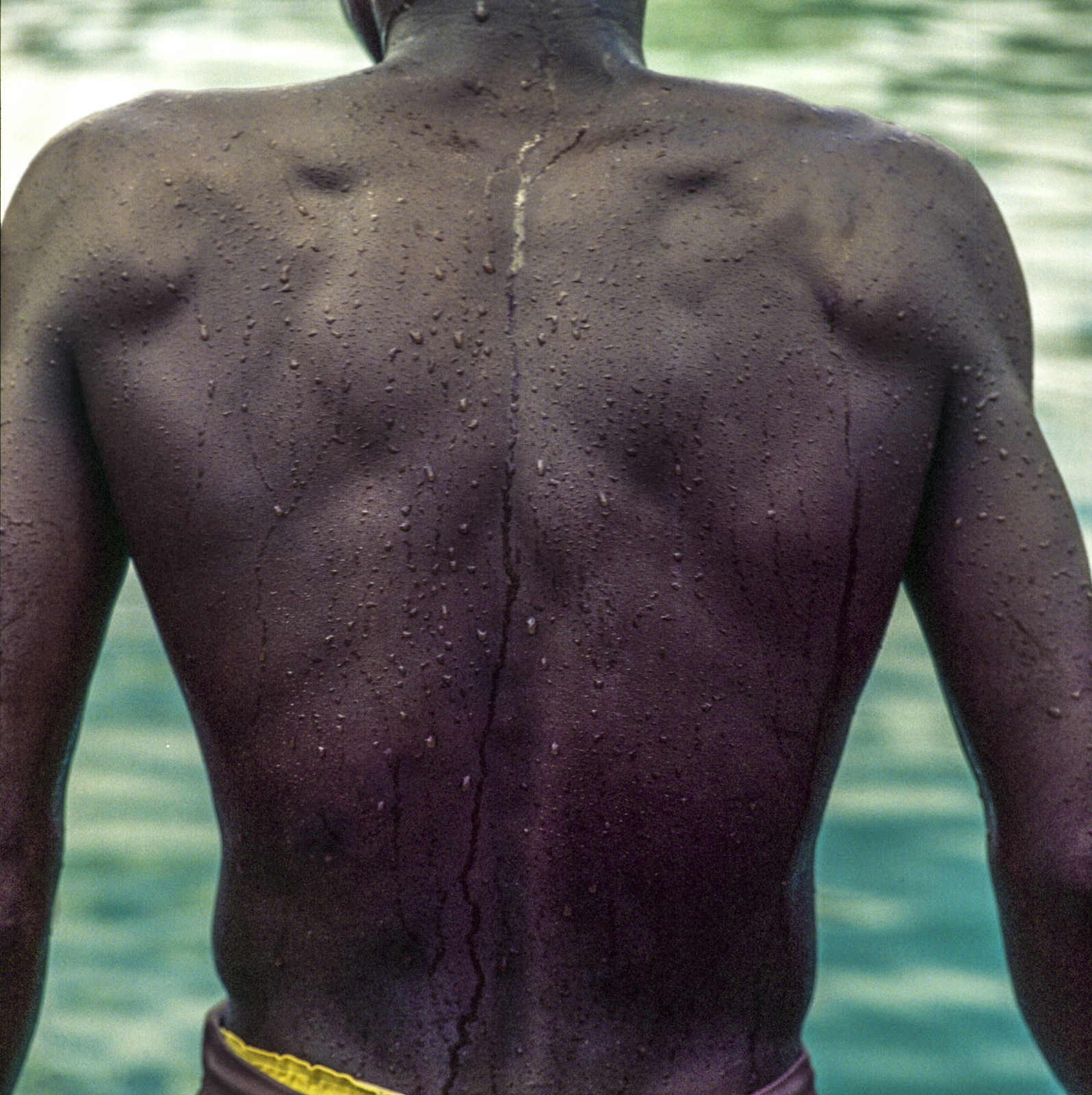

Perhaps the most socially significant color is that of skin tone. It has led to systemic racism and wars with geographic, political and economic consequences worldwide.
I see a time of Seven Generations when all the colors of mankind will gather under the Sacred Tree of Life and the whole earth will become One Circle again.
Chief Crazy Horse, Lakota war leader of the Oglala band

What we wear communicates status, mood and affiliation. Bright, bold colors may signal confidence or rebellion; subdued tones may suggest conformity or solemnity. Uniform colors in workplaces (e.g., blue scrubs in hospitals and uniforms in law enforcement) denote roles and responsibilities. Bottom line: Color communicates!

Color is a power which directly influences the soul.
Wassily Kandinsky, Russian painter and art theorist
_____________________________________________________________________
My other sites:
Substack: Poetry and insights relating to creation and Creator
David L. Smith Photography Portfolio.com
Ancient Maya Cultural Traits.com: Weekly blog featuring the traits that made this civilization unique
