In my experience, more people seem to be moved more by color photographs than black and white. That’s understandable—color is more visually stimulating and it’s how we see the world. Our brains are wired for it.
In our photography classes at RIT we sometimes heard some adage: “If you can’t make it good, make it big. And if you can’t make it big, make it in color.” At times, this appears to be operating when the intent is to sell photographic prints. Generally speaking, whatever the medium, the more vibrant the color or bigger the image, the greater its emotional impact. Color commands our attention.
As a professional visual communicator I tried to chose colors that would enhance the message or contribute to the sensibility of the environment, atmosphere or action. One of the items in my film & video production toolkit was a chart of the psychological properties of various colors. It helped me choose the color of backgrounds, costumes, paint, objects and environments when shooting, and again in editing because the objectives are to capture and hold the viewer’s attention and generate an affective (emotional) response. Whatever we’re creating, even if words on a page or putting together a gift for someone, color both speaks and creates an affect. Here, I’ve expanded the chart.
RED is masculine, stimulating and lively. It can signal passion, courage and strength. Depending upon the context it can also be aggressive and defiant. It was was my “go-to” color for creating excitement.
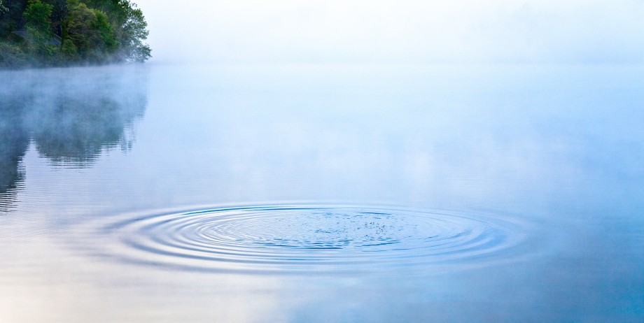
BLUE is intellectual, the color of the mind. It evokes trust, serenity, reflection and calm. Strong blues stimulate clear thought and soft blues are conducive to consideration and reflection. It’s why I chose the calm blue of a lake for the masthead of this blog. On the negative side—all colors have higher and lower vibrations and effects—it can convey coolness or aloofness.
YELLOW is emotional, the color of optimism, friendliness and creativity. Bright yellow is open, encouraging and inviting. On the dark side, bordering on brown, it can promote feelings of fear, depression and anxiety. When a product, message or scene needed to convey a sense of confidence, that the advertiser could be trusted, I tried to incorporate yellow.
GREEN is the color of balance and harmony. It conveys the sensibilities of peace, awareness and freshness—like an expanse of verdant grass. We have a natural affinity to green because it signals life, the presence of water and the potential for food. The lower vibration of green can be stagnation and sameness.
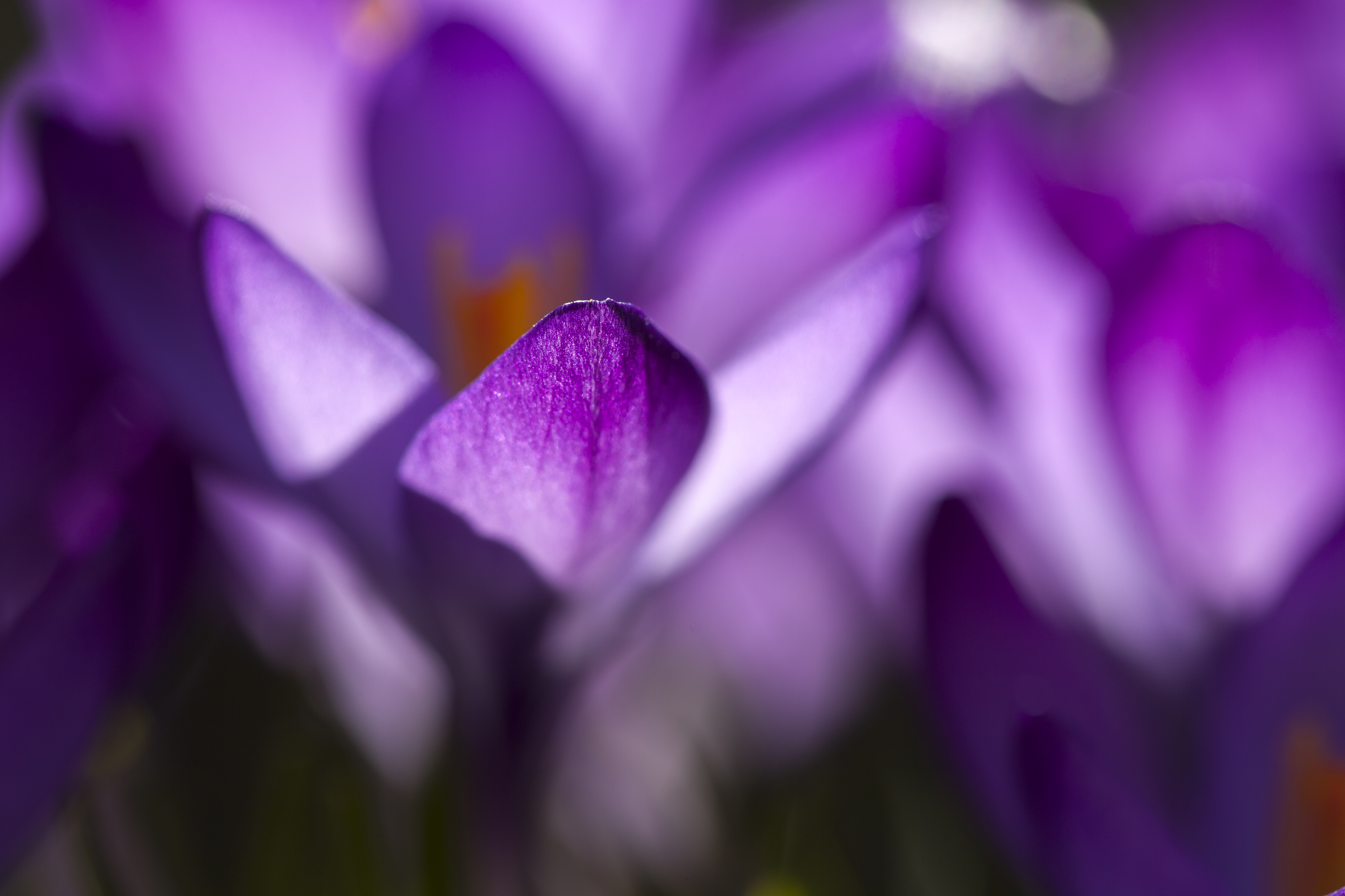
VIOLET is spiritual on the lighter side, the color of awareness, vision and truth, even luxury. On the dark side it can be cloying and annoying, the vibrance being so strong it boarders on decadence or suppression.
ORANGE reminds us of food, fruit in particular, so it contributes to feelings of comfort, abundance and security. On the bright side it photographs well in ads that contain food. Think of seafood commercials. Along with red and yellow it’s one of the “fun” colors used to enhance motivation. The dark tones of orange can convey the opposite—deprivation.
BROWN is serious, referencing both the earth and waste. On the light side, its contribution to a message or product is stability and warmth. On the dark side, it can convey a heaviness, even depression. It doesn’t photograph well in ads containing food.
BLACK is a mix of equal amounts of red, green and blue pigment. It’s also the absence of light. Its sensibility can be dark, sophistication, efficiency and security. Positively it communicates clarity. Negatively it expresses oppression, coldness and heaviness.
WHITE conveys a sensibility of purity, simplicity, efficiency and sterility. Just as black absorbs all wavelengths, white reflects them all. White light contains all the wavelengths. On the negative side it can convey strain, unfriendliness and coldness.
Color Harmony and Discordance
Along with the psychological characteristics of color, I often shared with students the creative uses of color “harmony” and “discordance.” Color harmony is when one hue—such as reds, greens, or yellows—predominate. Because it’s rare in nature, it commands attention, creates impact and contributes to the experience of simplicity. Doing so, color harmony conveys beauty and emotion.
Conversely, images that contain a variety of different colors side-by-side—as when yellows and blues are juxtaposed—contribute to the experience of complexity. Their strength is in conveying information. It depends on what you want to say or express; different communication objectives call for different strategies.
Color and Culture
Color choices have a profound effect on our lives. Children are taught to match their clothing colors. Professionals in many fields select colors that “pick up” and enhance particular features, for instance in the food, fashion and furnishing industries. Harmony is generally more peaceful and comfortable than discordance, which can be brash.
One of the common complaints of people shopping for a home, condo or apartment is the color of the walls and floors. Scenes and entire movies are tinted to enhance the sensibility of the story—blues for crime, purple for suspense, yellow for history, red for passion and so on depending on what the director wants the audience to feel.
We even describe our moods and physical conditions that way—“I’m feeling blue today” or “That burger left me feelin’ green.” Linda, my wife said, “It it wasn’t for color, I wouldn’t be a gardener.”
The color white promotes healing spirit, white light is a natural pain reliever, increasing and maintaining energy levels and relieving depression and inertia. White dispels negativity from the body’s energy field.
Lynne Branard, Novelist. Author, The Art of Arranging Flowers

This is awesome :)
LikeLike