Chapter 6: Contrast
In photography, “contrast” is the ratio between the darkest dark and the lightest light within a frame. It’s said to be “soft” when there’s very little difference between the lights and darks, “medium” in what we regard as normal, and “high” when an image has both maximum blacks and brightest whites.” Contrast is never one thing: it’s the difference between two things.
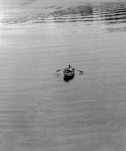
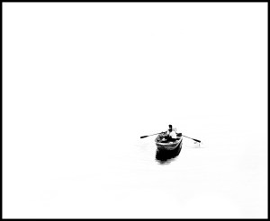
The low contrast image on the left looks “muddy” because there is very little difference between the blacks and whites. A medium or “normal” contrast image has some deep blacks and bright whites, with a full range of grays in between. Generally, fine art photographers tend to print for the darkest blacks and the brightest whites which the substrate (usually photographic paper) can accommodate. This maintains some detail in the shadows and highlights. At the other end of the continuum, in this extreme high contrast image there are barely any grays. The whites are as bright as possible and the blacks are totally dark. While this effect can be accomplished in image editing software, I produced this effect in the darkroom. I began by making a duplicate of the negative on Kodalith film, an emulsion that only renders pure black and white.
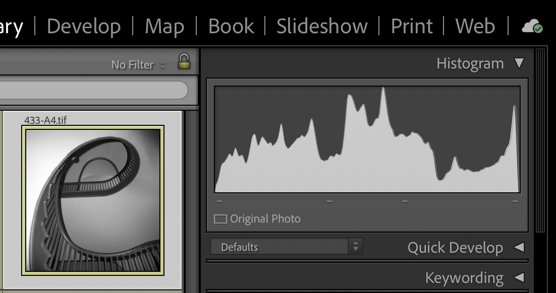
In the digital world, cameras have a built-in histogram that displays brightness levels. These can be adjusted for each of the primary colors and the extremes of dark and light. Whatever the medium, Dmax (maximum density) and Dmin (minimum density) are devoid of detail. Being able to control contrast is both technically and aesthetically important because it determines the amount of detail that will be visible in the shadows and highlights. I highly recommend the “RAW” format for cameras because it renders better quality by capturing a high level of image detail, which allows for greater flexibility and more options in editing software.
Creative Application
Aesthetically speaking, low contrast evokes a calm, flat or soft sensibility. There’s detail in the blacks and whites. These images are not seen very often because they’re not generally appealing. Extremely high contrast images are bold, evoking a sense of starkness and clarity. When I was apprenticing, I sometimes heard photographers use the word “snap” as an indication of the desirable contrast range. That’s where there are pure whites and pure blacks in the frame and a full range of gray tones in between—as illustrated in this grey scale.
This is a section of a “Kodak grey card.” Reflecting 18% of the light. Professionals used it with an exposure meter to determine the luminance under various conditions to get a reading of “middle grey,” camera settings that would yield the full scale of tones.
Ansel Adams equated the tonal scale of photographic prints with that of a piano octave. His ability to accomplish the full range of tones on photographic paper earned him a reputation as a master craftsman. For that reason alone, his original prints are far superior to the reproductions in books, posters and calendars. When he showed prints to our class at RIT in the early ‘60s, I was inspired to make black and white photography my principle creative medium.
Technique
Contrast is determined in the first place by lighting. Outdoors, cloudless sunlight creates high contrast—bright areas with dark shadows. Using editing software, photographers get better results by increasing the contrast of low contrast originals, rather than vice versa.
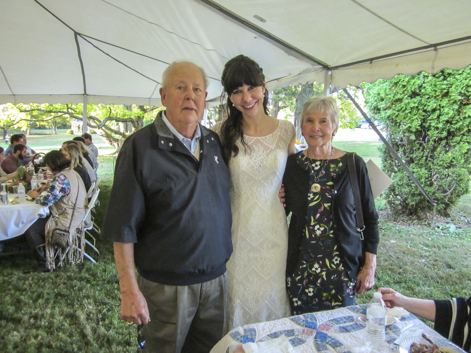
This is why wedding photographers prefer to shoot groups in the shade or under a diffuse cover on a bright sunny day—and use flash, not only to freeze the action, but also to establish highlights in the eyes. Working inside with lights, the standard practice or “starting point” for portraits is to use three lights—a “key” or main light that illuminates one side of the subject, a less intense or feathered “fill” light that provides some detail in the dark shadows created by the key light and a “backlight” positioned behind the subject to convey a sense of depth by creating a rim around the subject. To maximize contrast, eliminate the fill light altogether. To decrease contrast, bring the fill light closer to the subject. Having the key and fill at the same distance from the subject creates a very flat look.
Being the brightest light relative to others being used, the key is usually positioned where the primary source would be— whether actual or imagined. This man was photographed at night for a book cover. I reasoned that, because the train was stationary, the light would be coming from the railroad station. So I placed a single 1000W quartz light to simulate a night light on a platform. The tiny bulb maximized its specularity, thereby enhancing the sharpness of his skin and the texture of his hat. It also put a highlight in his eye. So the hat wouldn’t cover his eyes I had him look up rather than down, where passengers would normally be. The contrast was extremely high, so using editing software, a bit of detail was added to the shadows, mostly to give the image some depth. Relative to composition, the white shirtsleeve serves as a vector that directs the eye to the conductor’s face.
Reflections on Social Contrast
Historically, in the United States there were times of low social contrast, where there was little interest in public affairs and even less political engagement. The public’s enthusiasm was flat; the contrast range became contracted and a general malaise set in. Feeling disenfranchised and helpless, citizens largely disengaged and deferred to the preferences of their representatives. This image represents this situation. The subject matter can be recognized, but the expression is soft lacks vitality, socially and aesthetically.
On the other extreme, when enthusiasm turns to fixated passion to the extent that neither political entity can abide the perspectives of the other, the contrast becomes stark, relationships become contentious and the whole system tends toward dysfunctionality. Pictorially, extreme political contrast identifies citizens as either a black or white pixels. You can’t be gray. Extreme contrast is militant. It says, choose your position and defend it! There’s no detail, few grey areas, no substantive perspectives or open-mindedness in either direction. (The black and white image, rather than color, stands as a metaphor extreme differences).
Episodes of Madam Secretary and Blue Bloods on television provided demonstrations of how extremely high political contrast can be reduced to a functional level. In both instances, the characters representing the extremes, fully expressed their perspectives with well-reasoned arguments making sure their positions were clearly understood. (In formal debate, the first order of business is always for the participants to define their terms). With the point of disagreement clear, the characters came together and negotiated terms—in detail—that would satisfy both. They compromised and reached a workable, win-win arrangement.
An argument is reasoned when it’s based on logical discourse that flows from evidence, statistical analysis or proven facts, as opposed to opinions expressed emotionally without supporting evidence. For instance, an argument that begins, “The American people want… or know…” is the hallmark of an unsubstantiated emotional appeal. Nations are constituted of diverse people having too many perspectives and preferences to be lumped into a single philosophical category, despite what surveys or poles might seem to indicate.
At the end of a Blue Bloods episode, Frank Reagan, the NYC Police Commissioner played by Tom Selleck, rebuilt a contentious relationship that had developed between him and his daughter, Erin Reagan, the Assistant District Attorney played by Bridget Moynahan, by citing a particularly nasty hockey game where the players on both sides shook hands after the game. Respect was regained in that situation by acknowledging that, although the game was difficult and people got hurt, the higher ideal of sportsmanship was maintained.
Social contrast, like pictorial contrast, has to be managed. In the first place, that can only happen when both extremes loosen their grip on how to accomplish a common goal. That requires the participants to have open minds. Once the goal is clearly articulated and agreed upon, the means toward achieving it have to be presented in a reasoned argument on both sides. And that requires full concentration, understanding, respectful questioning and listening with an open mind. This is the period of “illumination.” Finally, and critically important, the participants must consider the maintenance of their relationship as equally important to winning the argument. Shaking hands, having a meal together, meeting each other’s families, frequent personal interaction—these ensure that the next game will be played well.
“Thank you” to the writers, producers and cast of Madam Secretary and Blue Bloods. They are prime examples of television that’s socially responsible, showing the full range of human experience, and how the extremes can be peacefully managed.
The critical contrast between seeing and looking-at cannot be overestimated. Seeing touches the heart. Looking-at is cold hearted. The difference may be a matter of life and death.
Fredrick Franck, artist
________________________________________________________
My other sites:
Substack: Poetry and insights relating to creation and Creator
David L. Smith Photography Portfolio.com
Ancient Maya Cultural Traits.com: Weekly blog featuring the traits that made this civilization unique


