
Chapter 5: Elements of Composition

In pictorial art, composition relates to how visual elements are organized within a frame. Through the centuries, both Eastern and Western artists developed guidelines to help them maintain a viewer’s attention. Aspiring artists and many in the public appreciate that the organization of elements within a frame influences the viewer’s experience of an image.
How does it work? How does composition contribute toward capturing and holding someone’s attention? Each of the aesthetic dimensions being treated in this series are contributing factors, but specifically related to composition are the principles of unity, balance, focus and placement. Because these rules have been confirmed as appealing to the eye across cultures, adhering to them is advisable. At the same time, they can and are often broken. My advice to students, “If you want to break the rules, do it for good reason and beautifully.”
Visual Elements and Information Theory
An eye for composition develops more quickly by regarding subject matter as visual elements, the parts of an image that together make up the whole. By enclosing space within a frame of any sort, the message to viewers is “Look here. I want you to see this.”
Imagine a dot like this ( . ) anywhere on a white background that’s framed. That’s one “bit” of information. It simply “says” it’s a black dot and it exists. It conveys no meaning because meaning derives from context and relationship. When we add another dot in that frame a relationship is established and it generates the question: “What does it mean?” The artist had something in mind, and the viewer’s challenge is to make sense of it—if they care to. Add a third dot and the potential for meaning increases dramatically. The relationship becomes more complex. Because the elements are within a frame, the viewer assumes they must be significant in some way. And that’s the context, urging the viewer to identify the subject, understand the relationship and why it’s being presented. What’s going on here?

Being human, we tend to anthropomorphize, so the three stones above could be interpreted as parents and child. Which would be the father? Actually, any of them could be, but our preconceived notions assign “him” to the larger stone because men are generally larger than women and children. The composition itself, how the stones are arranged, “speaks” as well. Notice the larger stones are touching. And why is the small one not touching the others? What might the color and differences in texture convey? What does it say that one stone has more texture than the other?
As more elements are added to an image the relationships become complex and the meaning more apparent. Each additional element—line, squiggle, circle, form or subject matter—regardless of size, shape, texture or color is another bit of information.

And the background is another. The more information there is within a frame, the more readily a viewer can discern its meaning, even perhaps the artist’s intention, mood or preferences. So what’s the story here?
Creative application
Communication Objective
To more consciously create an image that’s expressive, the consideration of composition should relate to some purpose or communication objective. What do I want viewers to see, think or feel? Or what do I want to say? Broadly, there are two reasons why we arrange elements within a frame—to express something or provide information. Sometimes both. In practice, if the intention is to express, reduce the number of visual elements—simplicity. If it’s to communicate, increase them—complexity. Does this notion of simple/complex apply to sound as well? What about food? Architecture? Lifestyle?
Unity

In the visual sense, unity relates to appropriateness. Are the elements within the frame justified relative to the expression or communication objective? There shouldn’t be a dot, line, surface, form or anything else that doesn’t contribute to the whole statement. For instance, the impact of this photograph would be less unified if there was a kite flying in the sky.

Aesthetic unification usually requires getting in close, zooming in or changing the angle to exclude everything that doesn’t relate to the principal subject. Unity strengthens the expression and communication objective. When an image is unified, it makes a clear statement, even if it abstract.
Balance

An image is balanced within a frame when the elements are similarly “weighted” on both sides of the frame, or top to bottom. Art students are taught to think of the frame as having a fulcrum at the bottom center of the frame. Ideally, the elements don’t tip the scale on one side or the other. A balanced composition feels good; an image that’s top or bottom heavy or right or left feels “off.” It pulls the attention toward the bold or heavily weighted subject matter, making it challenging for the eye to move freely within the frame. Of course, if the communication objective is to express a feeling of instability or attract attention through imbalance, the elements can be purposefully unbalanced. Above, the clouds and poles diminishing in size and number on the left, balance the tall, darker one on the right.
Focus

An image is compositionally focused when the subject matter is prominently placed within the frame. It’s the “dynamic center,” the point where we want the eye to go to first and return after wandering. Focus is important because it conveys the expression or accomplishes the communication objective. As the central feature and point of critical focus, it “says” what the image is about. This is generally accomplished by going in close, excluding as many secondary elements as possible. Maximizing compositional focus is why closeups are so powerful. A lack of focus is confusing. For instance, a seascape that puts the horizon in the middle of the frame top-to-bottom could be a statement about either the sky or the ocean. Which is it?
Placement

It’s been said that the greatest compliment a viewer can pay an artist is the length of time they attend to their work. The arrangement of elements within a frame largely determines how long the viewer will stay with an image, and how their eye will move around it. In this series, all the aesthetic dimensions being considered influence that arrangement. Organization of visual elements is a skill, gained by studying the works of master image makers and analyzing our own creations to see what works and what doesn’t.

In Western cultures we read left-to-right and top-to-bottom, so the eye is best directed within a frame by having a face situated on the right of the frame looking left into the space. That way the eye enters the frame on the left, connects with the subject’s eyes, pauses and returns to the left, the direction the person or animal is looking. Were the subject placed on the left of the frame looking right, the viewer’s eye would go to the subject’s eyes and continue out of the frame on the right, shortening their attention. The rule is to keep the viewer’s attention engaged in the frame as long as possible. To do this, the elements need to be arranged so that no line, sightline or vector leads the eye out of the frame.

Eye leading and circular composition
Famous painters throughout history used “compositional flow” or “eye leading” to maintain the viewer’s gaze. Longer attention encouraged deeper engagement. Artists accomplished this by creating actual and imaginary grids to create balance and movement, the golden mean to create harmony, vectors to create visual pathways, framing devices like trees and architectural elements and circular composition to continuously guide the viewer’s eye from one element to another. Photographers working in this way often use view cameras, because composing on a 4×5 or 8×10 glass plate allows for the meticulous arrangement of elements.
The Rule of Thirds

Rule of Thirds Grid
To situate subject matter within the frame in the most pleasing way, and to better control eye movement within it, artists devised a scheme where they divided an imaginary frame into thirds to create a grid. The “rule of thirds” advises us to not place the principle subject matter dead center in the frame, instead, to place it where the lines of the grid intersect.
Sacred Geometry
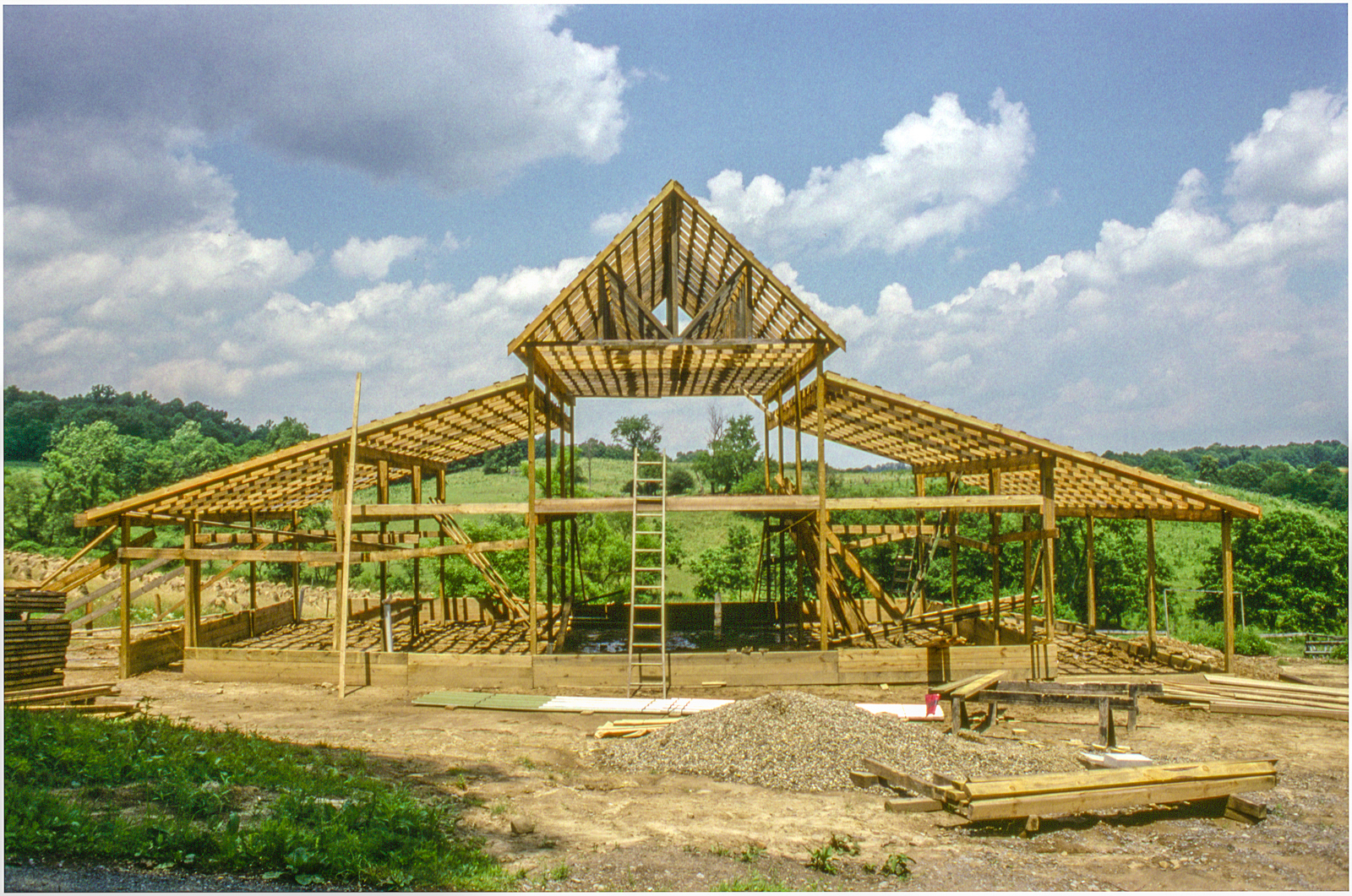
An Amish construction based on the principles of sacred geometry
An example of architectural resonance
Anciently, artists discovered ways of ordering elements within a frame that evoke a numinous feeling, a sense of spiritual wholeness or grandeur. They found that certain geometric forms, those with specific mathematical properties, somehow set up a resonance within us. This aesthetic dimension is amazing and vast. I recommend a visit to a well-illustrated page in Ancient Wisdom.

Golden mean overlay
A geometric form that’s especially applicable for photographers is the “Golden Ratio,” illustrated by the spiral. It’s based on a 5:8 proportion. I use it to format images and place primary subject matter on the imaginary “sweet spot.” I highly recommend Sacred Geometry by Robert Lawlor. Its many illustrations allowed me to translate the philosophy of sacred geometry into tools for everyday use. Most libraries have the book. If you use Lightroom software you can overlay a variety of grids like this. In “Develop” mode press the “R” key to bring up the grids. To change them, press the letter “O.”
Reflections On Personal and Social Order
When objects—books, chairs, cars, buildings, neighborhoods—are ordered, they establish and display a regular pattern or sequential arrangement that looks and feels complete, managed. When all our “ducks” are in a row, they’re in a satisfying and assessable alignment. Order and disorder communicate, so we have to be careful in making judgments based on the composition of other people’s environments. For instance, a neighbor can have toys and tools scattered all over their yard, left out in the rain with weeds growing over them. And then there’s another neighbor whose toys and tools are neatly stowed in a garage or shed, leaving the grass open and well-trimmed. We may be tempted to think the former suggests an uneducated, uncaring person. Even reading these descriptions, it’s likely you formed an opinion. But the disorderly neighbor could have a Ph.D. in microbiology and sing in the church choir, and the orderly neighbor could be a radicalized individual building a well-organized collection of handguns in his basement preparing for a terrorist attack.
A principle in the anthropology of visual communication holds that “everybody notices everything.” Another is “What we see we evaluate relative to our history, experience and worldview.” And “We tend to see what we want to see.” Yet another, we find what we’re looking for.” Judgments relating to order help us place ourselves and others within a social context. On the other hand, if we let them, our judgments can create chaos, build walls of separation and encourage stereotyping. The order-disorder continuum alone, is therefore not a good criteria for making judgments about people.
Expanding the context from personal to social order, Margaret Wheatley, noted systems theorist and management consultant offered eight social principles relating to the subject of order and organizations—how we compose our lives. The following are quotes from her book, A Simpler Way.
- We live in a world in which life wants to happen.
- Organizations and societies are living systems.
- We live in a universe that is alive, creative and experimenting all the time to discover what’s possible.
- It is the natural tendency for life to organize, to seek greater complexity and diversity.
- Life uses messes to get to well-ordered solutions.
- Life is intent on finding what works, not what’s right.
- Life creates more possibilities as it engages with opportunities.
- Life organizes around identity.
Expanding the subject even further, to the nature of reality, theoretical physicist David Bohm developed the concept of “implicate” and “explicate” orders. Using the analogy of a rolled-up carpet, he proposed that we should think of the objective or Absolute Reality as a “pattern” that already exists, complete and fully formed within the roll. The pattern is already there but hidden. We can’t see it until, in time, the carpet unrolls and the pattern becomes visible—the reality we experience. Dr. Bohm was one of the first scientists, extrapolating from quantum theory, who theorized that reality and consciousness constitute a coherent whole that’s in a process of unfolding.

Chaos is infinitely complex order.
David Bohm, physicist
________________________________________________-
My other sites:
Substack: Poetry and insights relating to creation and Creator
David L. Smith Photography Portfolio.com
Ancient Maya Cultural Traits.com: Weekly blog featuring the traits that made this civilization unique
