
Chapter 2: The Aesthetic Dimensions
Artists working in visual media train themselves to perceive beyond looking by continuously imagining or creating actual frames around everything they see. After a while a pattern emerges in the subjects they choose and the materials and techniques that work best. Along with these, they develop certain aesthetic preferences—choices relating to the arrangement and nature of visual elements, the ones they consistently find beautiful, pleasurable or interesting. Seeking them out and working with them, the artist develops a unique “style.”
So too, expressive photographers develop an “eye” by identifying their aesthetic preferences. For me, in the process of wanting to make photographs that fed my soul, I discovered that my favorites were exquisite light, simplicity, gradation and geometry. Whether I found these or constructed them singly or in combination, I could count on the resulting images to have the intended effect. Not always, but often. With the completion of this series, I’ll elaborate and provide examples of the following aesthetic dimensions.
WHAT ARE YOUR AESTHETIC PREFERENCES?
Abstraction
Abstracted subject matter is not readily identified, so it rivets and holds the viewer’s attention. They wonder, is there some meaning here, or is it just a pleasing image?
Atmosphere
This generally refers to weather conditions playing a role as a visual element. It takes the form of condensation, precipitation, or particulate matter such as steam, smoke, fog or smog. Mist and fog diffuse the light, softening the scene. Elements close to the camera are sharp. With distance, color saturation diminishes and blurring increases to produce a veiled or muted effect.
Color Harmony
A photograph is harmonious when the colors within the frame are predominantly the same hue. There can be few or many elements within the frame, but they will all be the same relative color on the spectrum—yellows, reds, greens— even if they vary in saturation and brightness. They stand out from the everyday norm, so they catch and holds our attention. They’re pleasing to the eye.
Color Discordance
Here, many different hues, opposites, are included in a frame. It can evoke a sense of clutter, frenzy, or confusion. Because they’re the norm, once the viewer identifies the subject matter the tendency is to look away. It works best when the objective is to convey information rather than express or elicit an emotion.
Contrast
In image formation, “contrast” is the ratio between the darkest dark and the lightest light within a frame. Contrast is said to be “soft” when there’s very little difference between the lights and darks. “Medium” is what we regard as normal. And a “high contrast” print has deep blacks alongside bright whites or highlights.
Composition
Pictorial composition is the arrangement of visual elements within a frame. Once the established rules and guidelines are understood, an artist can “break them beautifully.”
Unity relates to appropriateness. Not one dot, line, surface, form or subject matter is in the frame that doesn’t belong.
Balance occurs when the elements are neither bold nor heavy in one area relative to the overall space. The elements are not heavy top to bottom or right to left. The usage feels right.
Rule of Thirds advises us to imagine the frame segmented into thirds horizontally and vertically. Avoid placing principle subject matter dead center. Instead, place it where the lines of the grid intersect.
Dynamic Center refers to the point of critical focus within a frame. It is best placed according to the rule of thirds, not in the center of the frame.
Vectors or “Leading Lines” are lines along which the eye travels within a frame—bright highlights on telephone pole wires, a pointing finger, a tree branch or cast shadow.
Perspective is the artist’s point of view. Normal POV is eyelevel. Photographers and filmmakers prefer to situate the frame at angles above or below, left or right or tilted relative to the subject.
Depth of Field
Technically, “depth of field” (DOF) is the optical property of a lens that expresses the distance about the plane of focus where objects appear acceptably sharp in an image. Creatively speaking, it’s the relative degree of sharpness between objects that are close to or farther away from a lens. In practice, the features that concern the photographer are a) the lens’s aperture or f-stop, b) the focal length of the lens, and c) the camera-to-subject distance. Each is an independent variable, but they combine to produce the depth of field.
Form
Forms are three-dimensional. They are best represented in a photograph through depth or roundness. In black and white, without color dominating, gradations and shadows across rounded surfaces and shapes convey a sense of volume.
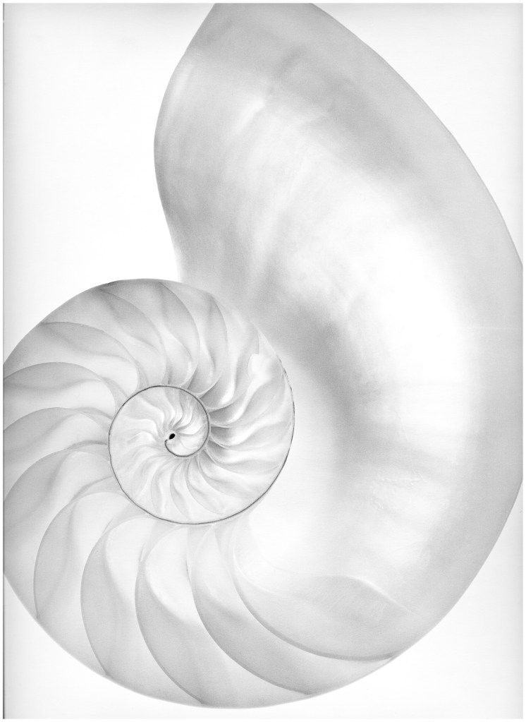
Geometry
Shapes, circles, squares and triangles can create structure, perspective and balance within a frame. The shape of an object immediately suggests its size and importance. “Sacred Geometry” is the ordering of elements in a way that they evoke a numinous feeling, a sense of spiritual wholeness or grandeur. Certain geometric forms, those with specific mathematical properties, somehow set up a resonance within us. I recommend a visit to Ancient Wisdom.
Gradation
This is the gradual or graded change of tones across a subject’s surface. In black and white, it’s a transition from light to dark or from one texture to another. In color it’s the transition from one hue to another or to a different saturation or brightness. As the eye moves across graded tones there’s a slowing of the aesthetic sensibility, a more pensive and flowing experience.
Key
“Key” refers to the overall brightness or darkness within the full frame. “High Key” images are predominately bright and white—a white cat sitting on a white background. “Low Key” is dark and somber—a black cat laying on a black background.
Line
Lines serve to define length, distance and shape. They indicate boundaries and create separation of forms, textures and colors. They can have thickness, evenness, brightness, length and direction. They make shapes, create visual variety and rhythm, simulate texture, separate colors, suggest movement and create the illusion of depth—railroad tracks to the horizon.
Light
Photography is literally, “Writing with light.” Awareness of its properties and behavior is a critical requirement for all artists, especially photographers. Black and white photography is the better learning medium; color can easily be converted. Rule #1: Consider the light source, it’s intensity, quality (color), direction and modifiers (how it’s being shaped; specular? diffuse?)
Pattern
Through repetition, patterns set up a rhythm that suggests order. We see them in the most fundamental energy fields within the atom, in the immensity of the cosmos, and the way we function, behave and spend our time. Artists in every field look for patterns and incorporate them into their works, in part because they evidence and reflect universal patterns and evolution.
Shadow
Shadows contribute greatly to the illusion of three dimensions and “normal” everyday reality by providing evidence of depth and contrast. They turn an ordinary subject into an image that pops—backlit people casting shadows on concrete, shadows of beach chairs on a deck.
Simplicity / Complexity
An image gains in simplicity when it has fewer elements. It becomes complex as more elements are added. The former is largely absent from our everyday environments—and lives—because we’re surrounded with so much “stuff.” Artistically, the latter requires the reduction or elimination of visual elements. One is not better than the other; they have different communication objectives. Generally speaking, simple images have greater emotional impact and tend to hold a viewer’s attention longer. Complex photographs carry more information, simply because there are more elements. Both can have compelling outcomes.
Texture
The tactile sense is so acute and pervasive, subjects that are textured and lit appropriately are enough to elicit the sensibilities of smooth, rough, coarse and soft. Texture is minimized on a surface or object when the light is diffused and coming from above. It’s enhanced when the light is more specular (pointed without diffusion) and rakes across the subject from the side.
Recommended Practice
Carry a list of these in your kit. Consult it before going out—either to have these in mind or as “targets” to shoot for. For instance, determine ahead of time that you’ll go out looking for “textures” or “gradation.” This sharpens your perception as you walk around with a camera. The long-term goal is to identify the few aesthetic dimensions that consistently appeal.
As a regular pursuit, try to find or create a situation where you can create a “simple” rather than complex image.
